Years ago a sweet lady named Betty gave her opinion about using white in quilts. That soft-spoken piece of quilting advise has stuck with me like a whisper in my ear.
Using white in quilts can be more controversial than one might think.

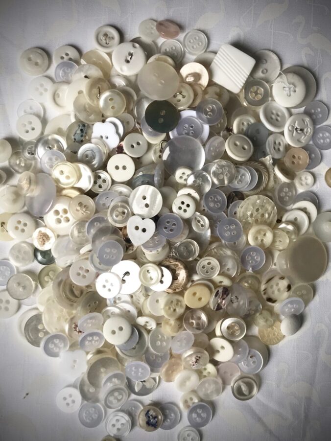
I would venture to say that most quilters (or anyone buying paint for their home) knows that white isn’t necessarily white. There’s off-white, cream, cotton, paper, snow, shadow, vanilla, milk, white wash, cloud…the lists of whites goes on and one!
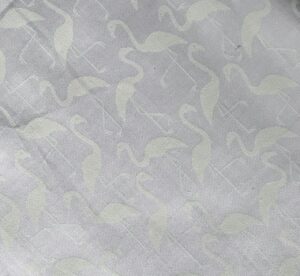
Quilters know they can use a fabric that isn’t actually white but it could “read” as white. One example of fabrics that use varying shades of white within themselves are “white on white” fabrics. Here is one example – which I LOVE – because this white on white has flamingos on it!
The definition of white from the dictionary is “the achromatic color of maximum lightness’.
White is the color that is perceived by the eye when exposed to all the visible wavelengths of light. Off-white colors can vary in hue, saturation and intensity.
Also see Monochromatic by Nature
So how does the definition of white relate to quilting?
According to Betty, one should never use pure white in a quilt. She believed it was too harsh on the eye. Now, does this mean that Betty never made a white-white quilt? I don’t know. I have definitely made quilts with bright white fabrics in them.
However, the context in which Betty was speaking when she gave me this advice was regarding the thread to choose for quilting a quilt with pure white fabric. She suggested using a warmer white. (I recall being a bit shocked.) She said the use of a softer white in the quilting thread provides a rest for the eye and softens the look of the entire quilt.

I remembered Betty’s advice when I used to quilt for customers. I chose an ivory thread, even on pure white quilts. It “read” as white on even the whitest quilts, but it softened their look.
In 2017, when I chose the background fabrics for Phoebee (my first pattern), I wanted to really go wild and use many varying shades of white. While it wasn’t necessarily my goal, I found that the use of varying shades of white provided a subtle interest in my designs. It also made me more “free” in my choices (and a bit of a rebel?). I felt I was challenging myself and eventually my student quilters to try to combine fabrics that don’t “match”. More than 35 patterns later, one of my favorite part of designing patterns is choosing the varying background shades.
I don’t get to see my friend, Betty, very often – especially now. But I think of her often and with admiration. She provided a valuable piece of advise to a novice quilter. You just never know how something you say today can stay with a person more than sixteen years later. Thanks, Betty! (hugs)