Category: Learn to Use Both Sides (Page 1 of 2)

Image of Karla holding quiltLearn how to use both sides of fabric to make stunning quilts!

From seeing features of more than 50 quilt patterns to learning how to audition both sides of fabric, this is where you find everything you need to know about using both sides.

Using both sides of fabric is an easy way to give your quilts a new level of interest. The subtle difference in value causes your eye to pause…to take in the beauty of the whole quilt.

Auditioning Fabrics

One of the most important (yet easy) lessons for learning to use both sides of fabric is the auditioning process. However, this isn’t a skill to be applied only to the more than 50 quilt patterns designed for this purpose. Quilters can apply this skill to all their future quilt projects.

Focus and Background Fabrics

In the broderie perse and fusible applique designs, you will first choose a focus fabric that is beautiful on both sides and has the proper contrast in value. Then you will audition both sides of the focus fabric with contenders for your backgrounds. It’s easy to do. Once you learn to use both sides of fabric, you’ll never look at one side again!

The key is value.

Most quilters choose fabric by color. Color is very alluring, even addicting (i.e. favorite colors). When you remove the color factor, you see the true values of fabrics. In The Tricky Traits of Value, you learn that values change depending on what is next to them. That’s why we audition both sides of the focus fabric with background fabrics.

Fun and easy.

It is fun and easy to learn to use both sides. That’s good, because we all need to enjoy our quilting journeys!

Great Color Value Test for Fabrics

Home » How To » Learn to Use Both Sides

Estimated reading time: 5 minutes

Do you want to know the easiest (yet most dependable) way to do a color value test for BOTH sides of fabric? You’re in the right place!

Treasures Quilt Pattern
Treasures at the beach with hazy, natural lighting.

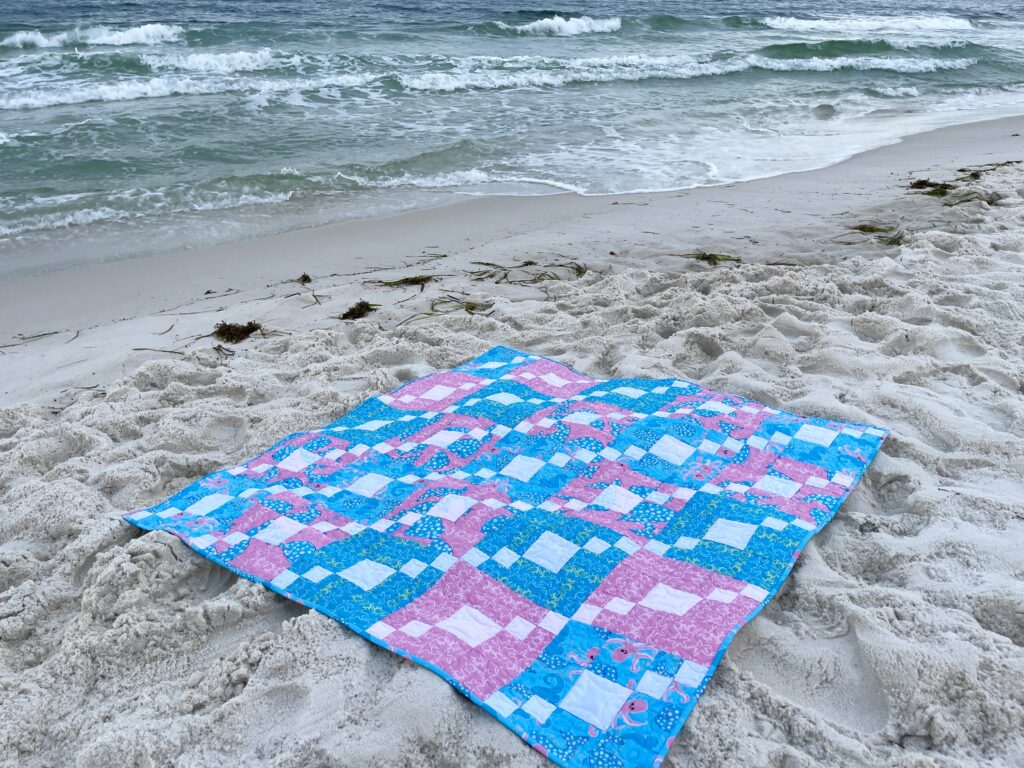
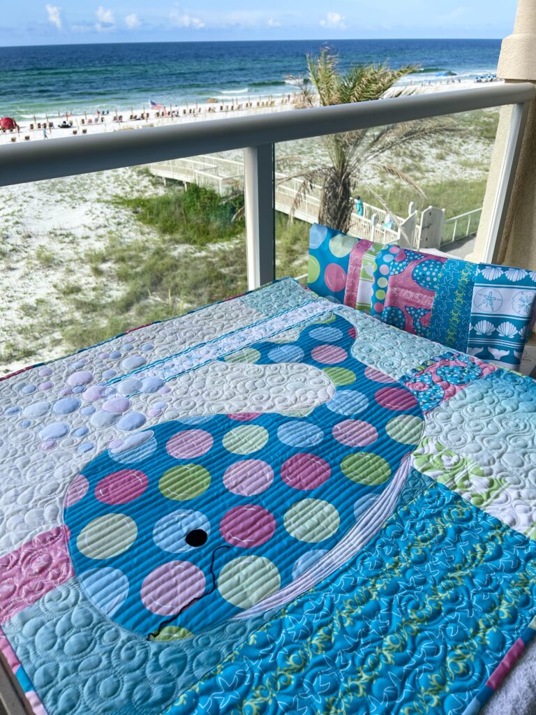
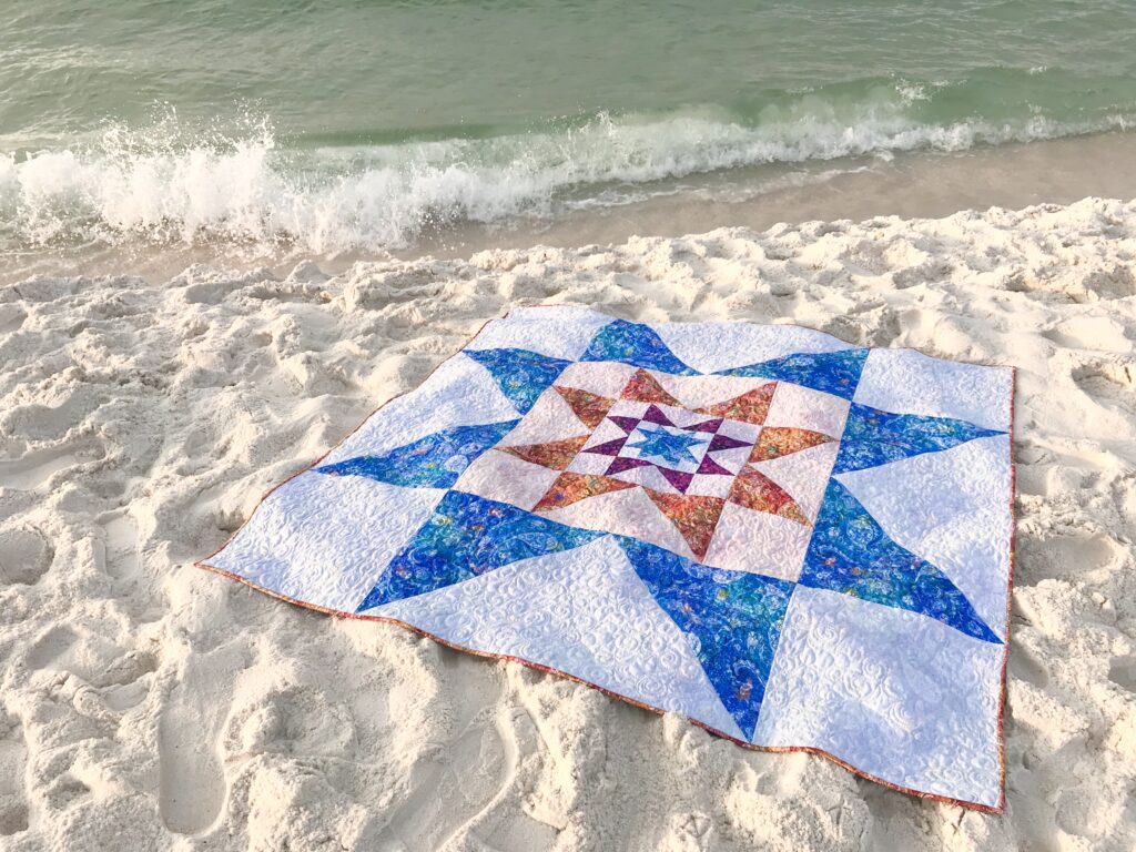
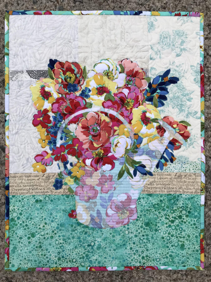
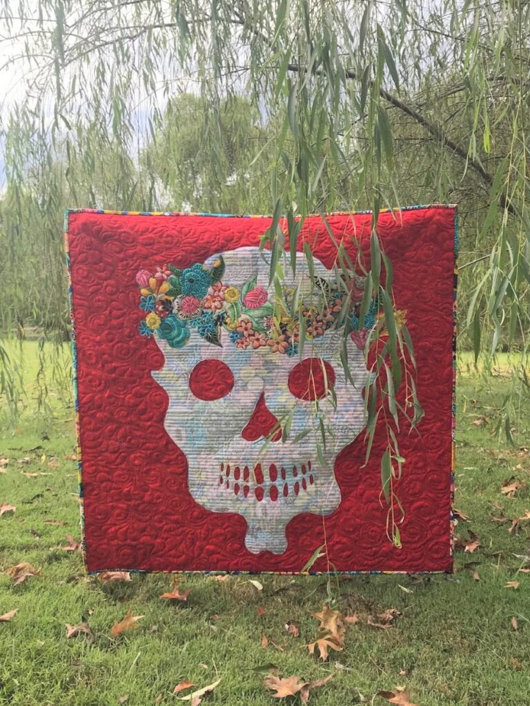
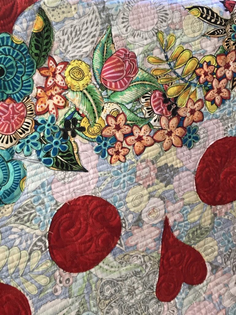
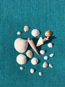
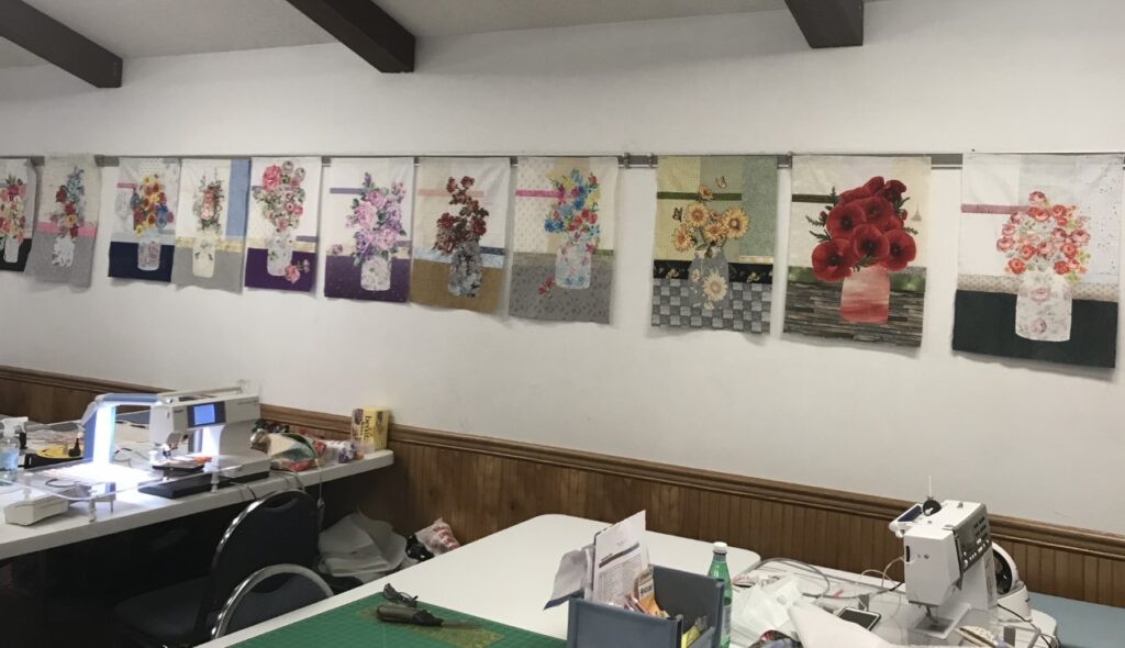
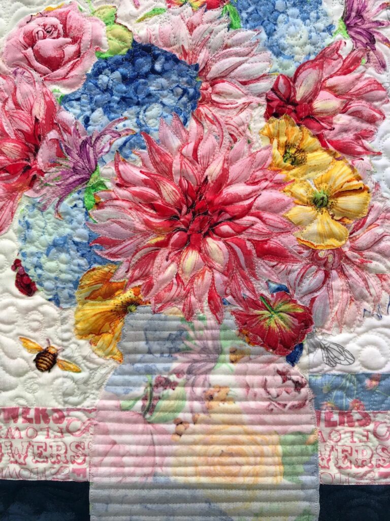
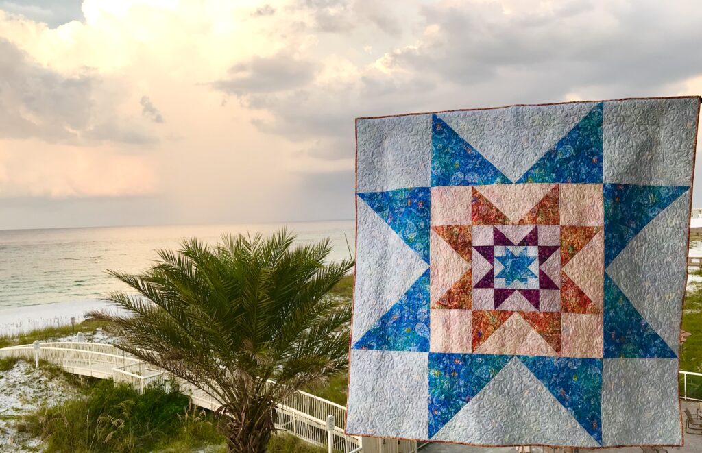
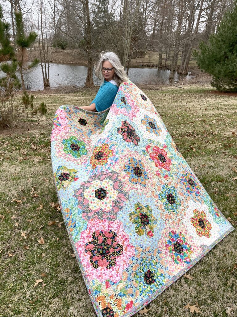
Let’s use the quilt above as an example. It’s call Treasures. This quilt is made with both sides of three fabrics with a soft white background fabric. Let’s pretend your are choosing fabrics for this quilt.

Both sides of each of the printed fabrics need auditioning.

However, not only will you audition both sides of each fabric with itself. You also need to test both sides of each fabric with each other and with your background fabric. Of course, this isn’t difficult. But some methods for a color value test are better than others. Here’s why.

The lighting plays a role.

The lighting conditions where you find the best fabric may be less than fantastical or even realistic. Inside lighting can drastically change the way a fabric looks. However, few fabric shops would be thrilled about us taking their fabric for an outing into natural sunlight.

Image of Coastal Christmas Decorations
Treasures displayed with a coastal Christmas theme.

The space you have for testing fabrics makes a difference.

For instance, with some methods you need distance from your fabrics and they need to be hanging vertically on a design wall. Another alternative may be to use a ladder to get high enough so that you can look down to view them on a table or floor. This could be a bit awkward.

Image of Quilt Block showing difference in color value test
Treasures is made with two versions of the Contrary Wife block. This is the “dark” version.

Therefore, while the methods of using a “testing block”, a door “peep hole”, or simply squinting your eyes may work well enough in your home, they aren’t reliable or easy methods to use when you are shopping for fabrics at your local quilt shop.

Perhaps you want to just take a chance, buy the fabric, and test it at home…I’m just gonna say, “Noooooo!” I’ve tested hundreds of fabric values and I still get stumped sometimes! You can quote me on this:

Colors can be tricky, but VALUE tells the truth.

Karla Kiefner

(My workshop students know.)

What’s a quilter to do?

Pull out your phone. You likely keep it with you anyway. It’s your best tool for the color value test. Here’s why:

Limited space is okay when you use your phone camera.

Simply open your optional bolt of fabric enough to turn a neat corner down, revealing both sides of the fabric. Lay it flat on top of the display of bolts in front of you or on a nearby cutting table. Hold your phone above the bolt, centering and leveling it as best you can, extending your arm as high as possible. Now reach up with your other hand (or use your thumb if you are real good at this) to tap the button, taking a picture. Indeed, it make take a time or two to get a level photo, but you’ll soon get the hang of it.

You can crop your photo, if needed.

While it’s not totally necessary, I prefer to crop distractions out of my photos so that I’m not seeing my feet or surrounding fabrics. To do so, use the edit tool that appears when you are looking at your individual photo.

You can adjust for less-than-optimal lighting.

Next, take a look at your photo to see if the colors look similar to what your eyes see in real life. If not, use the edit function again to make the photo closer to what you see. It doesn’t have to be perfect. Each phone camera is different, so you’ll soon learn if you need to lighten your photos or change with coloring, or use your photo as is.

The “light” version of the Contrary Wife block. Notice that the REVERSE is used for the same elements (half-square triangles) in both blocks.

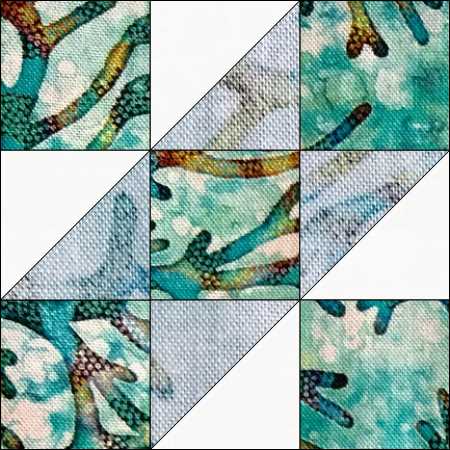
Finally, to do your color value test, change your photo to black and white!

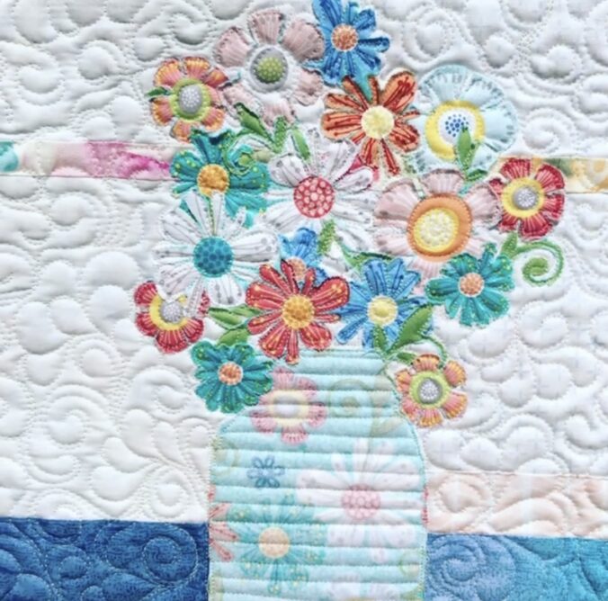
You might have a setting called noir or mono. Choose either of these to remove the color from your photo. Now look at your fabric. For this quilt, you need there to be a significant difference between the RIGHT and the REVERSE sides. Unlike one of the applique patterns, you don’t need to test each element (like flowers) with other elements (like a vase) in your quilt. There simply needs to be a good contrast.

After auditioning the printed fabrics with the color value test, audition them WITH your background fabric.

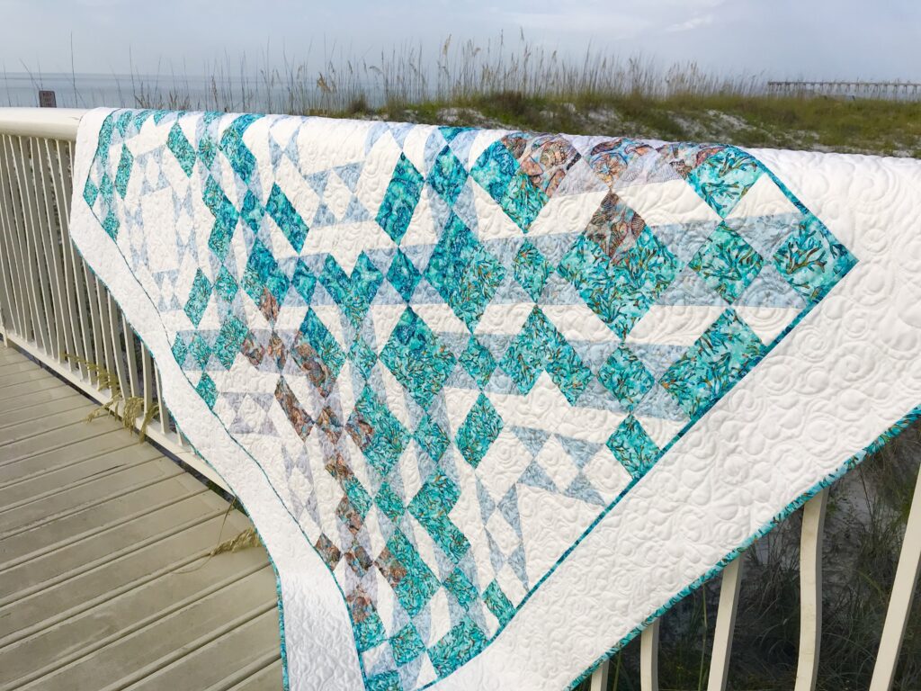
Oftentimes, when you find a line of fabrics with beautiful REVERSE sides and the contrast you need, you can make quick work of choosing which ones you want in your quilt because the contrast is similar in them all. The three I used in my Treasures were like that.

Lastly, make sure your REVERSE is still a darker value than your background fabric. That’s usually quite easy. Exceptions to that may be if you are usually a digitally printed fabric with an unusually light REVERSE.

Auditioning fabrics with this color value test is SO easy! It makes choosing fabrics FUN.

Be sure to watch Treasures on YouTube and SUBSCRIBE!

Shop more than 50 quilt patterns that use both beautiful sides of fabric in my Etsy Shop!

Creative Bee Studios on YouTube

Estimated reading time: 3 minutes

Creative Bee Studios is now on YouTube!

With exciting new Creative Bee Studios videos being added to YouTube, you can watch short clips to learn more about patterns and techniques any time you want!

Most assuredly, the queen of quilting on YouTube has to be non other than her majesty, Jenny Doan!

Years ago, Jenny, with the help of her kids, started recording videos. Those videos led her to fame and fortune and ultimately saved the town of Hamilton!

A great resource for quilters and crafters of all kinds.

Why add Creative Bee Studios to YouTube? Firstly, it’s a great way for many quilters to learn in the comfort of their own homes. Secondly, unlike online shopping platforms, videos let quilters see more and learn more before deciding on purchase. Thirdly, its a great way to share little tips and tricks which I normally share in classes and workshops.

Creative Bee Studios on YouTube

Being creative on YouTube includes knowing what to look for!

Not only can you learn just about any kind of quilting or stitching technique, you can learn to cook, play ukulele, train a dog, or build a fence!

My hope is to teach more quilters about the nuances of value and the fun of using both sides.

With more and more online business and increasing costs of doing business, it’s more important than ever to get click-throughs and followers on all social media.

image of video from creative bee Studios youTube

How you can help Creative Bee Studios on YouTube.

All I ask is a few clicks of your time! Here’s what you can do and it won’t cost you a dime.

  • Use the link above to go to my YouTube channel.
  • When you get there, click the SUBSCRIBE button.
  • Watch some videos and be sure to click the “like” (thumbs up) button.
  • Tap the bell icon so you’ll be notified when new videos are posted.
  • Click the “down” arrow where it says “Read More” to find the video description and helpful information. Click on the links there!
  • Share with everyone you know!

I am forever grateful for your support and interest in my creativity!

Be prepared for some laughter and bloopers. Funny things happen when the camera is rolling!

Perhaps I’ve come to this moment kicking and screaming, but the moment is here! Why be hesitant? I’m telling you right now, it’s really HARD!

Creative Bee Studios on YouTube

Learn more about Bubbles the Baby Whale Cuddle, Treasures, and The Adventures of Bubbles the Baby Whale soft book panel!

SHOP more than 50 quilt patterns that use both beautiful sides of fabric!

Learn more about using both sides of fabric HERE!

Spoonflower How-To

Estimated reading time: 5 minutes

Discover Spoonflower’s fabric and home decor!

Spoonflower’s fabrics and home decor are so stimulating, I liken it to walking into Hancock’s of Paducah (or any fabric warehouse) for the first time, without a clear quilt plan or shopping list! There’s so much to choose from -it can be delightful AND overwhelming!

Where do you start?

This is an overall guide to Spoonflower’s fabrics and home decor. I’ll explain what it is and how it works. You will “walk in” with an overall idea of where to go and what to do!

First, let me say that Spoonflower.com is not a difficult website to navigate. It’s just that, as creatives, we imagine ALL the possibilities when encountering a new product or venue. When you consider there are thousands of designs that can be printed on a variety of products, THAT can be overwhelming!

Because there are so many possibilities with Spoonflower, I think it’s helpful to wander in with some idea of what you will see.

spoonflower's fabric and home decor
Example of traditional designs.

Basically, Spoonflower is a print-on-demand fabric shop. Artists create design swatches. You find the one/ones you like, choose the type of fabric you want it printed on and place your order.

Pretty straight forward, right? It is. However, when you “enter” Spoonflower, you can see thousands and thousands of designs, it’s easy to get distracted. (You think you want frog fabric but you’re suddenly engrossed in pages and pages of beautiful florals.)

artistic nature
Example of “artistic, nature” designs.

So here are some basics to remember when you visit Spoonflower so you can stay on track:

Let’s start with fabric. There are categories, color, and fabric types.

Examples of categories include Style (Traditional, Modern, Nautical, etc.), Animals, Nature, Occasional, Holidays, etc.

Twelve color categories include numerous swatches in each to really pick the colors you are searching.

When it comes to fabric types, hold on to your hats! Spoonflower prints on 24 different types of fabrics! Examples are Canvas, Performance Velvet, Jersey, Organic Sweet Pea Gauze, Chiffon, Performance Linen, and my favorite, Organic Cotton Sateen! That’s just seven of the twenty-four!

Keep in mind that artists upload their designs for you to choose to print. There are thousands of artists uploading lots of designs!

Fill-a-Yard is a great option!

Fill-a-Yard is a great way to get many different designs in one yard of fabric. When you choose this option you first pick the designs you want. Next, choose the template. Do you want two half-yards or 12 dinner napkins?

When you find designs you like, click on the designer’s shop to see more. You can “favorite” what you like so you can go back to see that designer’s newest work.

What about home decor?

Spoonflower’s home decor is divided into four categories: wallpaper, living and decor, dining, and bedding.

Wallpaper: Choose from Prepasted Removable (smooth), Peel and Stick (woven), or Non-pasted Traditional (pebble).

image of wallpaper
BUBBLES Wall Paper by Creative Bee Studios

Living and Decor: Order pillows, blankets, curtains, or wallhangings in your favorite designs!

image of pillow
Bubbles pillow on Spoonflower

Bedding: Options include duvet covers, sheets, pillow shams, and lumbar throw pillows.

My designs on Spoonflower, like Seashore Friends Fabric Collection, are hopefully just a beginning point for my adventure into design work.

Image of Bubbles Quilt and Fabrics
Bubbles Quilt and Fabrics

See It’s a Whale Tale for more about designing this line of fabrics!

Whale Quilting Fabric on Spoonflower

Now head over to Spoonflower.com and have a ton of creative fun!

Enjoy your quilting journey, Karla

See New Textile Designs and meet Lord Stanley, the Great Blue Heron in A Great Blue Quilt!

Digital Quilting

For all of the handwork involved, quilting today also involves a lot of technology.

First, we can design our own patterns with software. Secondly, we check our phone apps for backing or binding requirements. Thirdly, you might use your phone camera to take pictures of fabric to match. (Learn how to audition BOTH beautiful sides of fabric using your phone*). Another option is to digitize your own embroidered labels or quilt blocks. We shop online and instantly download quilt patterns. As a result, all this technology can speed up our quilting experience.

Digital quilting technology gives you more options than ever before.

Pinterest, Etsy, designing software, and phone apps are just a few ways quilting technology helps us. With a click of a button you can add a border to that new quilt on EQ8. Add new stitches to your own embroidery design. Download your new favorite pattern online.

My current favorite phone apps are the Robert Kaufman Quilting Calculators, Missouri Star, Etsy, and even Monogram Lite. You can get apps for tablets and Ipads, too!

Digital quilting patterns give you immediate access. Just download and print on your own printer. It’s easy and instantly rewarding!

First, see a whole board of digital patterns from a variety of designers HERE.

In response to numerous requests for instant downloads, I’ve added digital versions of some titles. Many #usebothsides patterns include large paper templates. Therefore, I limit the downloadable versions to ones that fit a regular sheet of paper OR that won’t require monumental enlargements. See more about this at the VariLovable Star Digital Pattern post.

NEW digital quilting patterns added in my Etsy shop: Creative Bee Studios are shown as follows. Click on the photo to link directly to the product.

Image of Grace Quilt Pattern
Grace https://www.etsy.com/listing/788780357/
Image of Use Both Beautiful Sides Quilt
VariLovable Starhttps://www.etsy.com/listing/778654147/
Image of Noelle Quilt
Noelle Quilt Patternhttps://www.etsy.com/listing/896174897/
Image of Mini Digital Quilting Pattern
Lil’ Susiehttps://www.etsy.com/listing/882268640/
Image of Digital Quilting Pattern
Tropical Sunset

Check back for new digital download quilt patterns!

Lastly, technology helps us find quilt gift ideas. The digital side of quilting also gives use the tools to create our own works of art. So think about how you use technology in your everyday quilting. Do you create your own designs? Do you get inspiration from Pinterest or shop websites?

Subscribe to The BUZZ below or follow on BlogLovin’!

A Look at Modern Broderie Perse

Discover Modern Broderie Perse – a combination of new techniques and lovely traditions.

Use both beautiful sides of floral fabrics in many creative ways!

But first, what is modern Broderie Perse?

Image of Broderie Perse Traditional vs Modern

There’s a long history of Broderie Perse with origins dating back to the 17th Century in Europe. See more information about Broderie Perse HERE .

Fabric artists would cut around the artwork on fabric, often using subjects like flowers or birds, and hand applique them to their quilt work. Usually you’d consider this work to be exquisite, heirloom quality. Many hours of hand-stitching was involved in this method.

Fast forward to today’s modern Broderie Perse…

Today’s quilters have so many options and opportunities for quilt-making, most tend to make more quilts – and make them quickly – rather than spend hundreds of hours on one. How about you? Do “life events” (graduations, weddings, babies, etc.) push you at times towards faster, more “do-able” quilt projects?

Merle's Bouquet Quilt
Merle’s Bouquet quilt pattern

So what is Modern Broderie Perse? The basic concept of using floral (or other) motifs on fabric is still the same. You cut around the motifs and attach them to your quilt. Here you can see a variety of ways to use the motifs of your fabrics in a modern way while getting the traditional look and feel of Broderie Perse.

Christmas Quilt Modern Broderie Perse
Noelle Quilt Pattern

As you can see below, Flora is a quick project. The happy sugar skull is made with the reverse while her floral crown and binding are made from the front of the fabric. The key to making Broderie Perse modern is the use of fusible web and combining the edge finishing with quilting.

I recommend using a lightweight paper-backed fusible for these quilts. You’ll usually start by applying the fusible to about fat-quarter or smaller piece of fabric. Use a good pair of serrated scissors to cut around the motifs. Depending on your project, you might cut groupings of flowers all in one or partial flowers. You’ll see on some projects, I’ll use a bird, bee, or other motif from the fabric in the design. How many pieces you need to cut will depend on your focus fabric and your project. Once you arrange your Broderie Perse pieces on your quilt, you’ll fuse them with an iron – like you would a fusible template project.

See more examples of both traditional and modern Broderie Perse HERE.

The second element of making your Broderie Perse project quickly is securing the fabric to the quilt with your quilting stitches. This involves a doodling or tracing movement in your quilt, which is very free-form and forgiving. You can follow the motifs to add dimension to your Broderie Perse.

Image of Modern Broderie Perse Tropical Sunset
Tropical Sunset Quilt Pattern

Broderie Perse is a great way to add some pizzazz to your applique projects. Doing it a modern way makes it fast and easy!

Shades of White in Quilts

Years ago a sweet lady named Betty gave her opinion about using white in quilts. That soft-spoken piece of quilting advise has stuck with me like a whisper in my ear.

Using white in quilts can be more controversial than one might think.

Using White in Quilts
Shades of White

I would venture to say that most quilters (or anyone buying paint for their home) knows that white isn’t necessarily white. There’s off-white, cream, cotton, paper, snow, shadow, vanilla, milk, white wash, cloud…the lists of whites goes on and one!

Quilters know they can use a fabric that isn’t actually white but it could “read” as white. One example of fabrics that use varying shades of white within themselves are “white on white” fabrics. Here is one example – which I LOVE – because this white on white has flamingos on it!

Image of White on White Flamingo Fabric
White on White Flamingo Fabric

The definition of white from the dictionary is “the achromatic color of maximum lightness’.

White is the color that is perceived by the eye when exposed to all the visible wavelengths of light. Off-white colors can vary in hue, saturation and intensity.

Also see Monochromatic by Nature

Using white in quilts
Monochromatic by Nature

So how does the definition of white relate to quilting?

According to Betty, one should never use pure white in a quilt. She believed it was too harsh on the eye. Now, does this mean that Betty never made a white-white quilt? I don’t know. I have definitely made quilts with bright white fabrics in them.

However, the context in which Betty was speaking when she gave me this advice was regarding the thread to choose for quilting a quilt with pure white fabric. She suggested using a warmer white. (I recall being a bit shocked.) She said the use of a softer white in the quilting thread provides a rest for the eye and softens the look of the entire quilt.

Image of Using White in Quilts Button Collection
This was my mother-in-law’s white button collection.

I remembered Betty’s advice when I used to quilt for customers. I chose an ivory thread, even on pure white quilts. It “read” as white on even the whitest quilts, but it softened their look.

In 2017, when I chose the background fabrics for Phoebee (my first pattern), I wanted to really go wild and use many varying shades of white. While it wasn’t necessarily my goal, I found that the use of varying shades of white provided a subtle interest in my designs. It also made me more “free” in my choices (and a bit of a rebel?). I felt I was challenging myself and eventually my student quilters to try to combine fabrics that don’t “match”. More than 35 patterns later, one of my favorite part of designing patterns is choosing the varying background shades.

I don’t get to see my friend, Betty, very often – especially now. But I think of her often and with admiration. She provided a valuable piece of advise to a novice quilter. You just never know how something you say today can stay with a person more than sixteen years later. Thanks, Betty! (hugs)

To see Phoebee and all her friends, visit my Etsy Shop: Creative Bee Studios. Click HERE.

Modern Broderie Perse

Modern Broderie Perse is the method of cutting fabric motifs from fused fabrics. Its a faster way to achieve artistry in quilts.

Broderie Perse stands the test of time as a specialty quilting technique.

While this technique was popular in the 17th Century in Europe, Broderie Perse most likely originated in India. The fabrics were traditional florals. Birds and vases were also common themes. Sewers would cut the fabric by using the motifs as their templates. Then they turned the stitches and hand-appliqued them to backgrounds. The darker colors were often paired with beige backgrounds.

Image of Traditional Broderie Perse

I was only vaguely aware of this quilting technique when I discovered using the reverse side of fabric for my quilt pattern designs. I liked the idea of using fabric motifs as templates for cutting because it would allow each quilt to be unique. Imagine a dozen quilters using the same pattern, each with a different focus fabric. By cutting fusible applique from fabric motifs, each quilt is different in size, value, color, and style.

This is all achieved by using different focus fabric and a Modern Broderie Perse technique! Remember, it’s all about cutting fusible applique from fabric motifs.

So, for example, if your fabric has large flowers, you’ll cut fewer of them for your design. You’ll also space them differently. You’ll audition background fabrics with both sides of your focus fabric. Therefore, chances are your backgrounds will also be unique. You might add additional motifs, like birds or bees, in your quilt – whatever is in your focus fabric!

My classes taught me how adaptable Broderie Perse is – with their unique results!

Modern Broderie Quilts Made in Class
Fabulously different “Grace” quilts made by Heartland Quilters Guild Members!
Grace Quilt Pattern uses the Modern Broderie Perse technique.
Grace Quilt Pattern

Vibrant colors and variety of styles make Modern Broderie Perse exciting and fun for today’s quilters.

Merle's Bouquet Quilt made with Modern Broderie Perse
Merle’s Bouquet Quilt Pattern

Enjoy your quilting journey!

Sunrise Quilt Colors

The colors of a simple sunrise can inspire a whole quilt palette…

To start, I know I talk a lot about how to use color combinations from nature. (Color is very important to me!)

Naturally, in this post we’ll focus on colors. More specifically, sunrise colors. Below you see two color palettes featuring just five of the beautiful colors in these sunrise photos. If you look carefully you can find many variations within the clouds and shadows.

Now, I just love finding beauty in nature and pondering how to incorporate it into a new quilt. I took these photos years ago (2016) from my back deck.

Image of Sunrise colors

Next, I pulled five colors from the above photo. The colors are very contrasting colors and not ones I would’ve considered on my own. Moreover, the is good contrast in the values. See more on VALUE HERE.

Granted, there are many more colors in these photos than the five I pulled out, but you get the idea…inspiration is all around us – we just have to look!

In the same fashion, I pulled very different colors from the sunrise below. Another day, another sunrise, another quilt palette! Take a look at these brilliant sunrise colors!

How do you choose colors? There are so many options these days for quilters – it can be hard to find time to brainstorm your own ideas if you want to make all the great ideas, kits, and colorways already on the market! Actually, I think that’s what makes quilting such a creative market – there’s something for everyone, every occasion, and time limitation…and…the sky’s not even the limit!

See Nature’s Color Wheel for more examples of using nature for color inspiration.

Take a look at this monochromatic theme inspired by seashells.

Monochromatic by Nature

Check out Monochromatic by Nature, inspired by a few sea shells.

Similarly, color palettes for fabric collections can come from nature, too! See Seashore Friends at Spoonflower HERE!

Click the blue SHOP buttons at Creative Bee Studios for quilt patterns and NEW fabrics, home decor, and merchandise!

Finally, I hope you have a great creative quilting day that includes a bit of color-watching in nature!

Nature’s Color Wheel

Choosing colors for quilts doesn’t have to be difficult. While it might not be simple, using Nature’s Color Wheel can help!

Being a quilter who likes to have more than one quilt idea going at a time, I like to use nature to help guide my color choices for a quilt.

If you are in a time crunch or have run across a line of fabrics you adore, choosing fabric and colors for your next quilt can be a simple, quick process. I find that every now and then I need to grab a kit and make it up, quick as possible.

Most often, though, I like to have a longer process for choosing my quilt colors and fabrics. It’s a process. A dance, actually. You know, it involves colors, value, hue, and tints. But also, this requires a careful consideration of how each fabric interacts with one another, based on its placement. And sometimes the fabrics and the project need to…age.

If you like to have more than one quilting iron in the fire, like me, maybe you cherish this process, too!

When choosing my own fabrics for a quilt, there are two concepts I often rely on: color in nature and value.

First, let’s look at color. Nature just doesn’t get it wrong. Start observing natural settings, plants, animals, bugs, everything around you. Take pictures, or pin ideas to an idea boards. This might be in the form of photos in an album on your phone.

Nature's Color Wheel Christmas Cactus

There are many variations in the blooms above. These petals aren’t the truest red of the color wheel, but variations to the left and right. Shades of pinks and oranges grace these blooms. That’s why they look so beautiful with the very TRUE green!

Observe nature to choose colors and you can’t go wrong. I like to think of it as Nature’s Color Wheel.

Image of Nature's Color Wheel

The excitement in the photo above is partially from the vibrancy of the colors, but also the difference in value.

This beach sunset below may be dark, but even it has many colors in it, if you look carefully. Notice the purples, greens, pinks, coral, and blues? The values in this photo are more similar. Notice the calming effect?

Image of Beach and Sky
How many colors do you see here?

See more about value HERE.

Nature's Color Wheel
VariLovable Star Quilt Pattern

I challenge you to look around you today and collect some fabulous fabric ideas from the nature!

Most of all, enjoy your quilting journey.

Monochromatic by Nature

Even choosing a monochromatic quilt color can be a challenge!

First, you know I like to use nature to help choose a color palette for quilt projects, right? (See Nature’s Color Wheel for more information.) For this color challenge, I decided to take my cues from a beach walk. I didn’t expect to find black seashells on this particular white beach! So, I ended up with a monochromatic theme from nature.

However, I think using a single fabric for a one-color quilt can make the quilt seem “flat”, in regards to interest. (We do strive for flat quilts!) However, when you add more shades of one color, you can add interest to a single-color quilt design.

Its amazing how difficult it can be to choose fabrics for a quilt, especially for a new quilter. I distinctly remember the kind teacher helping me choose fabrics for my first quilt class at The Sewing Basket many years ago. It was for a patriotic quilt, so even though that palette was obvious, I had a lot of fear of choosing the wrong colors!

While, technically, a two-color quilt isn’t monochromatic, we often refer it is as so, especially when the second color is a neutral. If not a neutral, the second color should allow the “focus” color to steal the show.

I found these seashells on the beach and realized that even nature can be monochromatic.

The varying shades of black in these seashells are interesting. Don’t you love the contrasting shades of beige, also found in the shells?

Makes me think of batiks. You?

Generally, I love to mix “whites”. Therefore, finding these light shells with so many shades of white was really fun for me!

Here are two monochromatic quilts of similar colors:

Click picture for link to Amy’s Creative Side.
Click on link for Beech Tree Lane Handmade

Below is a fun use of value in a monochromatic quilt! See The Tricky Traits of Value HERE.

Image of Monochromatic Quilt
Click on picture for link to Craft Paper Scissors pin.

Also, see Sunrise Quilt Colors for more on using nature as your palette guide.

Do you make monochromatic quilts?

How do you choose your quilt palettes?

Be sure to Join The BUZZ for all the latest news and new product introductions!

Finally, enjoy your quilting journey, Karla

Read more at Shades of White in Quilts.

« Older posts