Estimated reading time: 6 minutes
Table of contents
- Choosing fabrics for quilts isn’t hard, but it can be tricky.
- To truly know the value of fabrics, you have to remove the color.
- When choosing fabrics for quilts, remember that values change depending one their surroundings.
- Light. Medium. Dark.
- Next, lets look at Belle, the butterfly quilt.
- Just take a picture.
- See How To Use Both Sides for more example quilt photos!
Choosing fabrics for quilts isn’t hard, but it can be tricky.
Choosing fabrics for quilts involves auditioning the color, size of motif, and value of the fabrics. I have long thought I understood the value of fabric values. Value is what makes, say, a simple, two-color quilt have bold areas of light and dark. Value also makes those cool secondary patterns in your multi-color quilt design appear like magic.
Easy, right? I thought so. However, a few years ago (actually about 20 now), Blended Quilts became popular. I became mesmerized by blended quilts. I bought the books and studied them, reading about fabric choices and how to combine fabric values to work together, while not being too obvious. Turns out, I never did really “get” it. It was too hard for me to look past the floral motifs and colors. Thankfully, our guild had a program presenter who sold blended kits! Problem solved (for the moment).
Turns out, choosing fabrics for quilts based on value can be tricky!
For the record, I love all kinds of quilts.
Karla
My Grandma Emma Wichern’s lavender and white embroidered quilt is precious to me. Simple, clearly defined values. But I also love those wild “crazy-quilts” which practically shout in all dark values. Modern is fun, bright, and happy…or sometimes calming and simple. I have a passion to some degree for all types of quilts. But what really gets me excited about a quilt is when it is successfully splashed with all kinds of rich, colorful and different fabrics…and it works! Value is what makes the magic happen in those quilts.
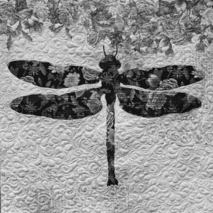
To truly know the value of fabrics, you have to remove the color.
You can do this numerous ways, but the simplest trick for me is to take a picture of fabric choices or my blocks on my design wall with my phone and change the picture to black and white (mono or noir). Colors and motifs can fool you. For us quilters, fabrics aren’t just fabrics. They evoke emotion (usually happiness). I used to fall in love with a fabric, or line of fabrics, and be determined to use it because of my emotional connection. Consequently, I’ve made some quilts that turned out okay, but had the potential to be brilliant.
When choosing fabrics for quilts, remember that values change depending one their surroundings.
That’s the tricky part! A quilter once said, “My Light looks too dark when I use that light of Medium.” Okay, that was me who said that, but it’s true! And, it can be tricky.
Light. Medium. Dark.
The fact that my neat little piles of lights, mediums, and darks can change their values, depending on what is around, them was a “V8” moment for me!
Let’s look at this dragonfly quilt for an example.
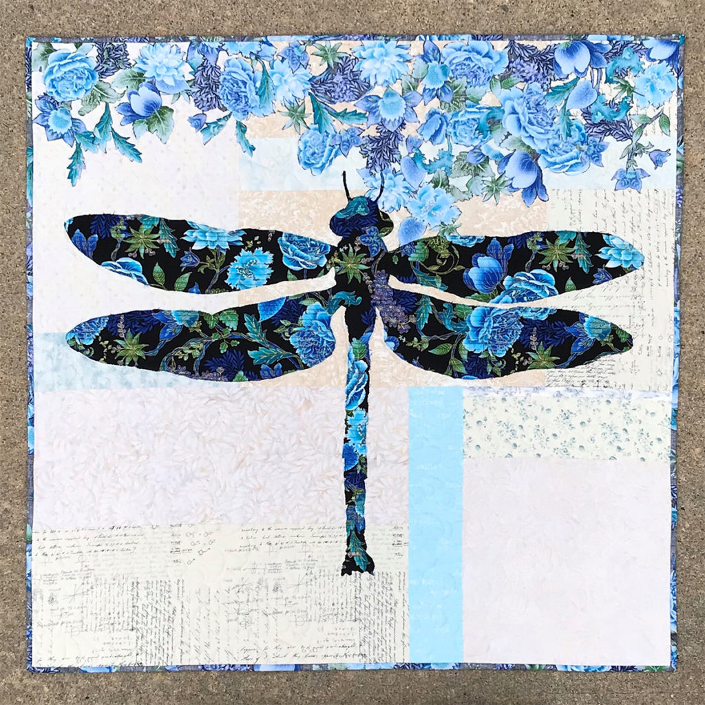
Lilly’s background is made of scrappy, light neutrals with a couple of colorful accent strips. The background is light when compared to the dragonfly focus fabric. The flowers at the top of the quilt are made from the reverse side of focus fabric. The flowers “read” as a medium value. Clearly the dark value of the dragonfly is what you notice first. The flowers are secondary. The various background fabrics catch your eye last and allow your eyes to linger on them.
When you are just working on your background, those strips of color can look quite bold and may seem too dark to be part of the background. But when looking at those same fabrics in black/white WITH the focus fabric laying across them, they all fall into the light category and they work!
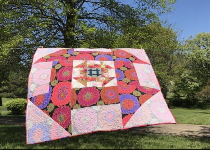
Phoebee is made with both sides of one focus fabric on a scrappy background. Choosing fabrics for this quilt is how I first learned the nuances of value. Using both beautiful sides of fabric taught me that lesson.
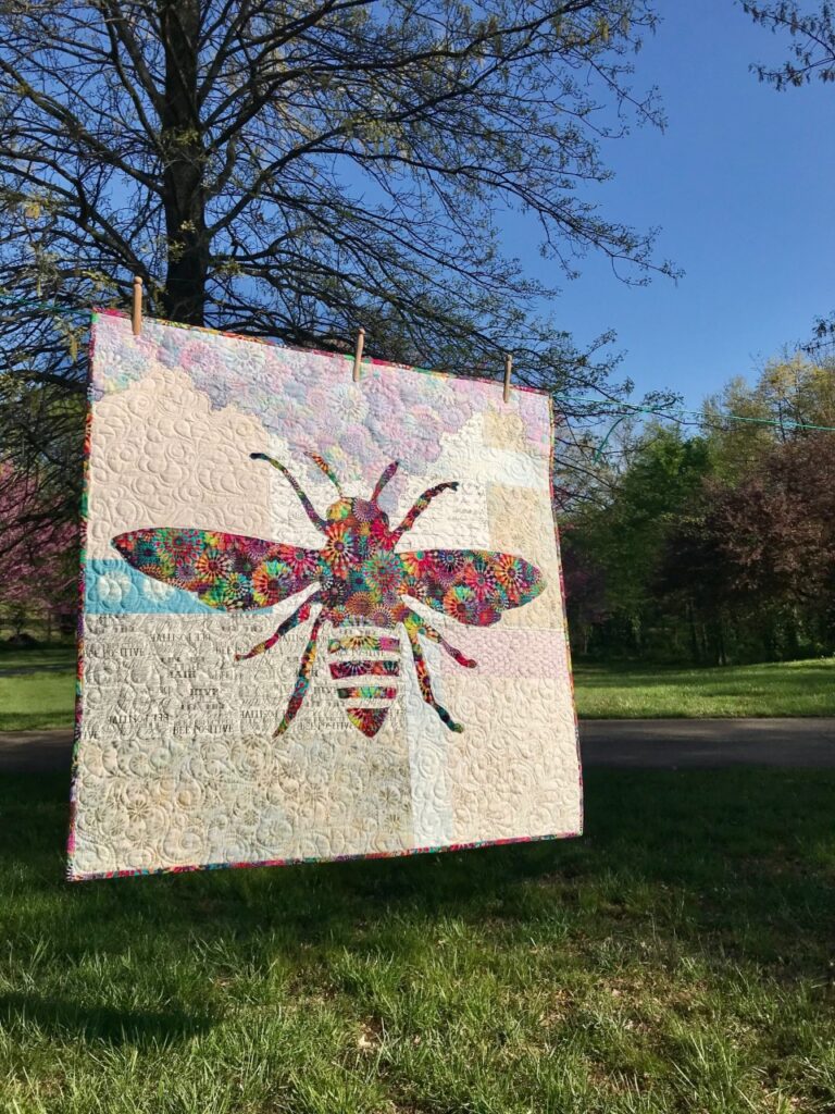
Notice that the boldness of Phoebee’s focus fabric allowed for a variety of values in the eclectic background. Phoebee is clearly the “buzz” of this quilt!
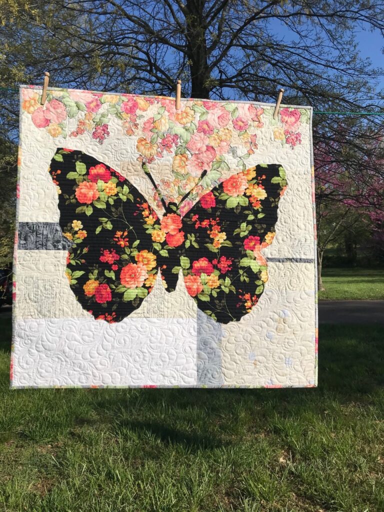
Next, lets look at Belle, the butterfly quilt.
Again, the RIGHT side of the butterfly focus fabric has a dark enough value that it can “handle” a lot from any background fabrics, including the accent strips. However, the REVERSE of the flowers made from the same background fabric are medium to light in value. Some of those flowers might have been lost if the value of the background fabrics were too similar.
In conclusion, choosing fabrics for these quilts might be a little out-of-the-box for some quilters, because they call for mixing so many colors of background fabrics. But if you follow this guideline it’s easy: If the value is right and you like the fabric, use it. It’s freeing to combine lots of “styles” of fabrics, like miniature prints, batiks, grunge and more! I encourage you to combine a variety of fabrics in your quilts. Remember, it can be fun choosing fabrics for quilts, when you take the guess work out of it.
It’s the combination of background fabrics that make these quilts sing!
Karla, designer
Just take a picture.
Read more at Mysterious Values
I learned a lot from this blog. I would have never thought to take a black and white picture to determine value. Thanks, good info.
Glad to hear that!