Tag: Quilt Color

Sunrise Quilt Colors

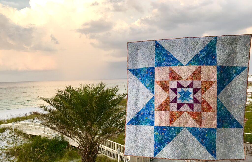
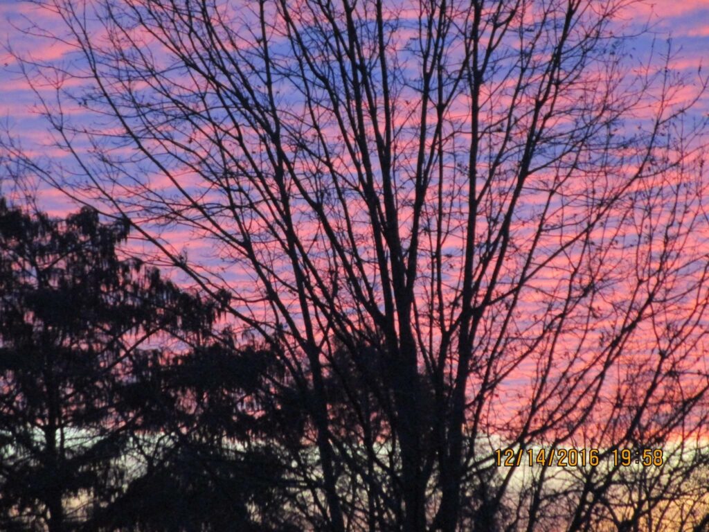
The colors of a simple sunrise can inspire a whole quilt palette…

To start, I know I talk a lot about how to use color combinations from nature. (Color is very important to me!)

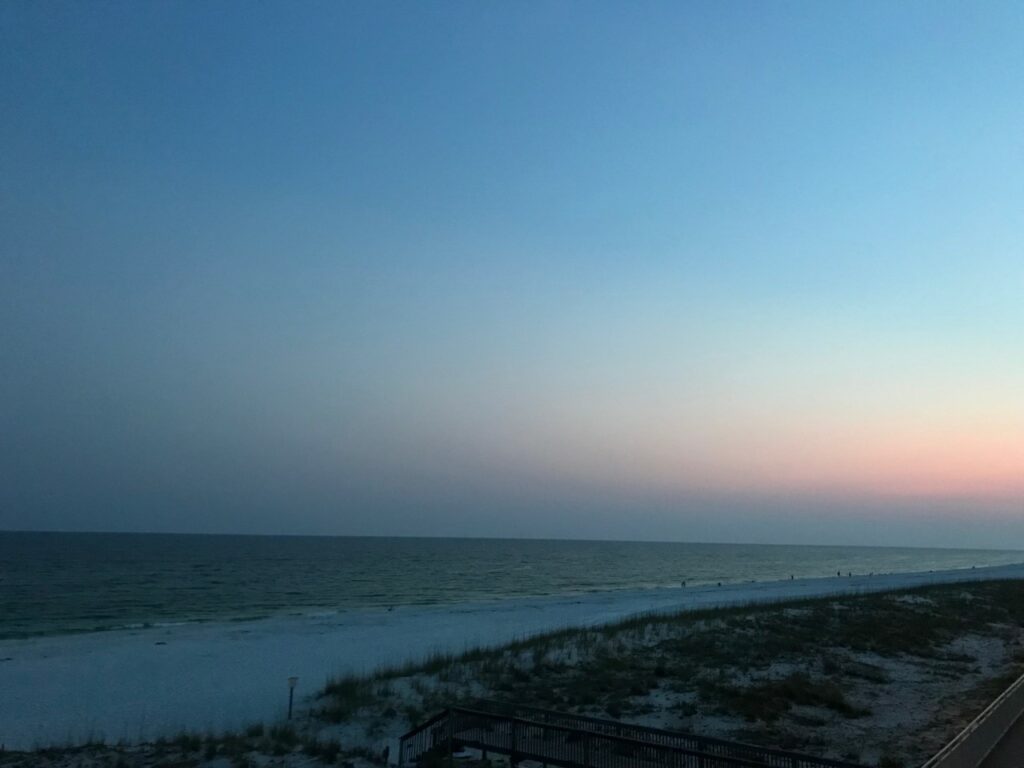
Naturally, in this post we’ll focus on colors. More specifically, sunrise colors. Below you see two color palettes featuring just five of the beautiful colors in these sunrise photos. If you look carefully you can find many variations within the clouds and shadows.

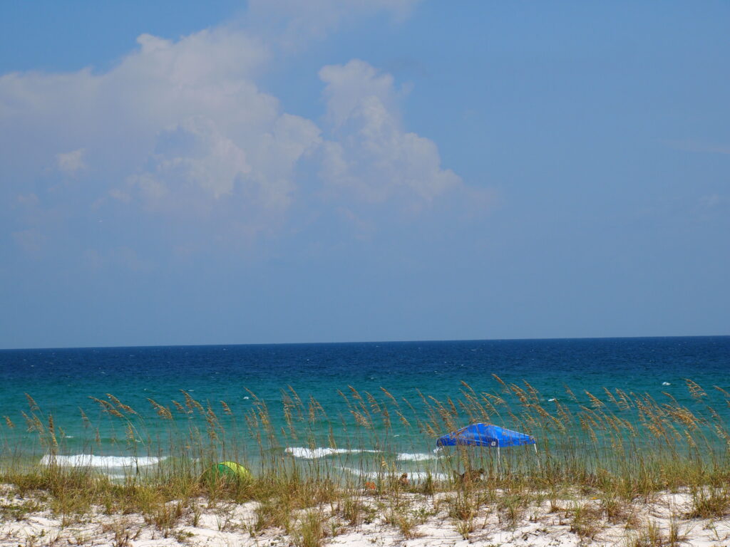
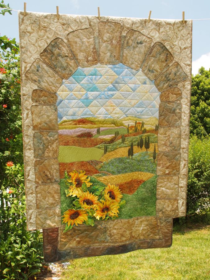
Now, I just love finding beauty in nature and pondering how to incorporate it into a new quilt. I took these photos years ago (2016) from my back deck.

Image of Sunrise colors

Next, I pulled five colors from the above photo. The colors are very contrasting colors and not ones I would’ve considered on my own. Moreover, the is good contrast in the values. See more on VALUE HERE.

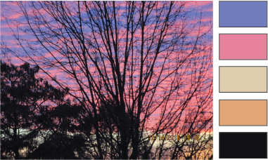
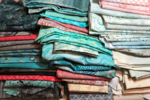
Granted, there are many more colors in these photos than the five I pulled out, but you get the idea…inspiration is all around us – we just have to look!

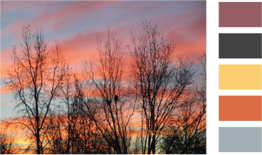
In the same fashion, I pulled very different colors from the sunrise below. Another day, another sunrise, another quilt palette! Take a look at these brilliant sunrise colors!

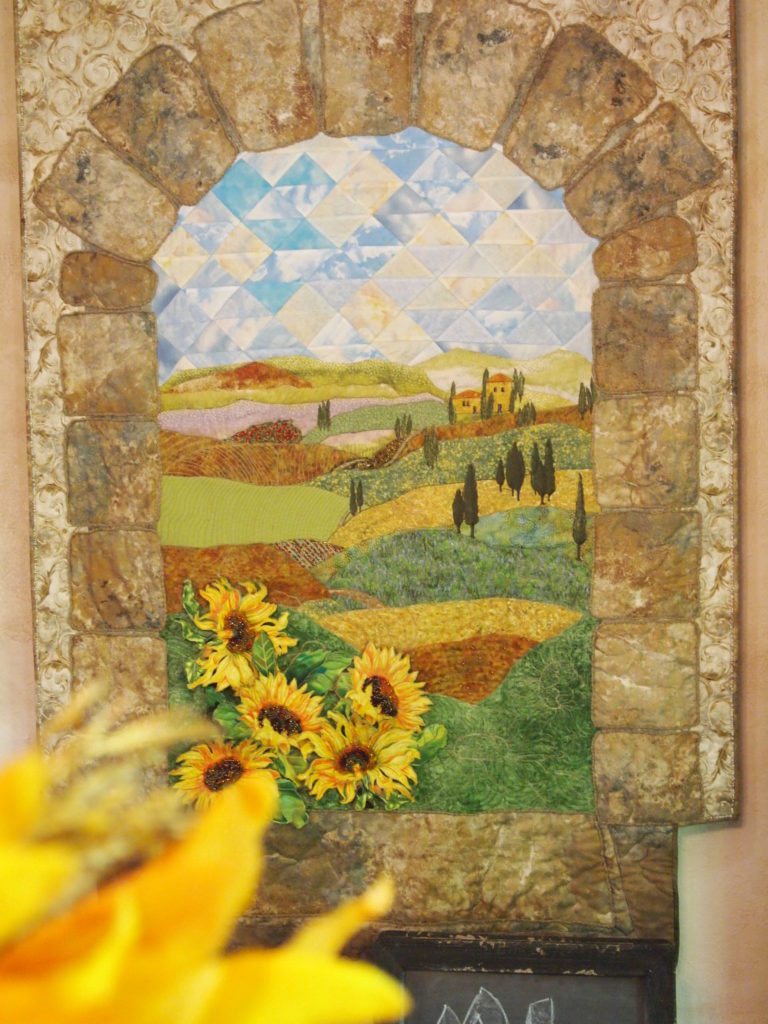
How do you choose colors? There are so many options these days for quilters – it can be hard to find time to brainstorm your own ideas if you want to make all the great ideas, kits, and colorways already on the market! Actually, I think that’s what makes quilting such a creative market – there’s something for everyone, every occasion, and time limitation…and…the sky’s not even the limit!

See Nature’s Color Wheel for more examples of using nature for color inspiration.

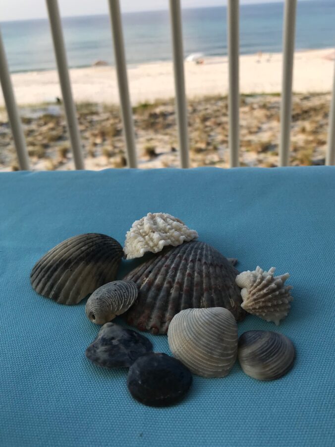
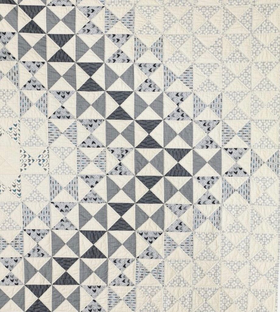
Take a look at this monochromatic theme inspired by seashells.

Monochromatic by Nature

Check out Monochromatic by Nature, inspired by a few sea shells.

Similarly, color palettes for fabric collections can come from nature, too! See Seashore Friends at Spoonflower HERE!

Click the blue SHOP buttons at Creative Bee Studios for quilt patterns and NEW fabrics, home decor, and merchandise!

Finally, I hope you have a great creative quilting day that includes a bit of color-watching in nature!

Nature’s Color Wheel

Choosing colors for quilts doesn’t have to be difficult. While it might not be simple, using Nature’s Color Wheel can help!

Being a quilter who likes to have more than one quilt idea going at a time, I like to use nature to help guide my color choices for a quilt.

If you are in a time crunch or have run across a line of fabrics you adore, choosing fabric and colors for your next quilt can be a simple, quick process. I find that every now and then I need to grab a kit and make it up, quick as possible.

Most often, though, I like to have a longer process for choosing my quilt colors and fabrics. It’s a process. A dance, actually. You know, it involves colors, value, hue, and tints. But also, this requires a careful consideration of how each fabric interacts with one another, based on its placement. And sometimes the fabrics and the project need to…age.

If you like to have more than one quilting iron in the fire, like me, maybe you cherish this process, too!

When choosing my own fabrics for a quilt, there are two concepts I often rely on: color in nature and value.

First, let’s look at color. Nature just doesn’t get it wrong. Start observing natural settings, plants, animals, bugs, everything around you. Take pictures, or pin ideas to an idea boards. This might be in the form of photos in an album on your phone.

Nature's Color Wheel Christmas Cactus

There are many variations in the blooms above. These petals aren’t the truest red of the color wheel, but variations to the left and right. Shades of pinks and oranges grace these blooms. That’s why they look so beautiful with the very TRUE green!

Observe nature to choose colors and you can’t go wrong. I like to think of it as Nature’s Color Wheel.

Image of Nature's Color Wheel

The excitement in the photo above is partially from the vibrancy of the colors, but also the difference in value.

This beach sunset below may be dark, but even it has many colors in it, if you look carefully. Notice the purples, greens, pinks, coral, and blues? The values in this photo are more similar. Notice the calming effect?

Image of Beach and Sky
How many colors do you see here?

See more about value HERE.

Nature's Color Wheel
VariLovable Star Quilt Pattern

I challenge you to look around you today and collect some fabulous fabric ideas from the nature!

Most of all, enjoy your quilting journey.

Monochromatic by Nature

Even choosing a monochromatic quilt color can be a challenge!

First, you know I like to use nature to help choose a color palette for quilt projects, right? (See Nature’s Color Wheel for more information.) For this color challenge, I decided to take my cues from a beach walk. I didn’t expect to find black seashells on this particular white beach! So, I ended up with a monochromatic theme from nature.

However, I think using a single fabric for a one-color quilt can make the quilt seem “flat”, in regards to interest. (We do strive for flat quilts!) However, when you add more shades of one color, you can add interest to a single-color quilt design.

Its amazing how difficult it can be to choose fabrics for a quilt, especially for a new quilter. I distinctly remember the kind teacher helping me choose fabrics for my first quilt class at The Sewing Basket many years ago. It was for a patriotic quilt, so even though that palette was obvious, I had a lot of fear of choosing the wrong colors!

While, technically, a two-color quilt isn’t monochromatic, we often refer it is as so, especially when the second color is a neutral. If not a neutral, the second color should allow the “focus” color to steal the show.

I found these seashells on the beach and realized that even nature can be monochromatic.

The varying shades of black in these seashells are interesting. Don’t you love the contrasting shades of beige, also found in the shells?

Makes me think of batiks. You?

Generally, I love to mix “whites”. Therefore, finding these light shells with so many shades of white was really fun for me!

Here are two monochromatic quilts of similar colors:

Click picture for link to Amy’s Creative Side.
Click on link for Beech Tree Lane Handmade

Below is a fun use of value in a monochromatic quilt! See The Tricky Traits of Value HERE.

Image of Monochromatic Quilt
Click on picture for link to Craft Paper Scissors pin.

Also, see Sunrise Quilt Colors for more on using nature as your palette guide.

Do you make monochromatic quilts?

How do you choose your quilt palettes?

Be sure to Join The BUZZ for all the latest news and new product introductions!

Finally, enjoy your quilting journey, Karla

Read more at Shades of White in Quilts.

One Easy Way to Conquer Color

Estimated reading time: 3 minutes

Image of Quick Trip Quilt
Tropical Trip by Karla Kiefner, Quick Trip Pattern by Eleanor Burns

Choosing color for quilts can be a daunting task.

Color for quilts is a common theme in the quilting book industry. Without a doubt, there are countless books on color theory.

Access to books on color for quilts isn’t my problem.

Unfortunately, wrapping my brain around the content in those books IS my problem! I wish I knew how many books there are which explain how to use color in making quilts. I also wish I knew how many times I looked at the color wheel. I know it, read about it, and studied it. However, going from page to fabric doesn’t seem to work for me!

Image of Fabric Stash

Color for quilts is in the details.

Many books about color go into great detail explaining the principles for mastering color for quilts. You can learn about:

  • hue
  • color
  • intensity
  • warm and cool
  • harmonies of triadic, analogous, split-complimentary, double-complimentary
  • complementary colors
  • and MORE!

Summarily, there are whole books of very small print, explaining everything you’d ever want to know about color for quilts!

Image of sunset for color for quilts

But they don’t work for me.

Likely, the reason is because I’d rather be making a quilt! But there is one thing I have learned about reading about choosing color for quilts: I have never been inspired by what I’ve read!

Look around you.

For me, I do better by “studying” nature. Sometimes its from a picture and sometimes it’s from real life. Either way, I find that nature, whether its a single flower, a landscape view, or a beach at sunset has perfect coloring. Furthermore, its inspirational!

Monochromatic by Nature

Read more about using nature as you color guide in Monochromatic by Nature.

Check your self with color charts and books.

Nevertheless, I am not recommending throwing color theory out the window. Instead, I prefer to use it to evaluate my choices AFTER I’ve been inspired with a color scheme. Color theory for quilts is obviously good and important information. I just want to learn about it while holding fabric!

SHOP more than 50 quilt patterns that use BOTH beautiful sides of fabric!

I will admit I am very much a color person. Color can evoke emotions in me that seem just a little over the top — I REALLY, REALLY love some and REALLY don’t care for others. Maybe you are like that, too? 

Using a Design Wall as a Palette

When you pin fabrics to your design wall, you can step back, get perspective, see how a fabric reads at a distance, and most importantly observe the values.

Granted most quilters don’t audition fabrics for four quilts all at the same time, but in this case, having four new designs waiting to be created made me realize how much more I like auditioning fabric on the wall rather than on the table or floor.

Plus, it’s much easier to take that black and white picture for observing value when the fabrics are in front of you! See The Tricky Traits of Value.

This past week was the kickoff of classes for Colorful Wings (click here for patterns) and I can’t wait to see the eleven finished quilts. In the meantime, my next post will give you sneak peek on how completely unique each of these winged-girls (and boy – yes, we had one boy) are! Image of Classroom

A big thanks to all of the eleven students who took the challenge to #usebothsides!

Shout out to The Golden Needle for hosting Colorful Wings.

Shop for Phoebee, Belle, and Lily from the Colorful Wings pattern series and Rose from the Colorful Petals series at www.etsy.com/shop/CreativeBeeStudios.

How do you audition your fabrics? Do you use a design wall? Please comment below.

Sign up below to get posts sent to you!

Six Sweet Tips for Using Color in Landscape Quilts

These six tips for using color in landscape quilts makes choosing them a breeze!

The tips for using color, of course, depends on subject of your landscape. But there are some general tips that can help make that process fun.

Let’s start at the very beginning…a very FUN place to start.

Tips for Using Color Shown in Bella Vista quilt.
Bella Vista by Karla Kiefner

My favorite part of landscape quilts is when I’m first digging through my fabric stash, searching for any fabrics which might remotely play nicely in my quilt…folding them into shapes, layering them on top of each other…imagining.

  1. When choosing fabrics for a landscape quilt, choose a wide variety of dark, medium, and light fabrics, mostly cottons, but also other textures. (I have been known to cut up old clothing for the right fabric in a small space.) You can’t have too many!
  2. Throw in some “wild card” colors! Go ahead and grab fabrics you might not immediately think of for nature scenes, both by color and print. Add some purple, copper, gold, olive/brown, gray, and gray-blue or colors with those combinations in them.
  3. Use those “ugly” fabrics! Of course, you don’t want an entire quilt of your least favorite fabrics, but they do have an important role because they make your beautiful fabrics really pop.
  4. When auditioning your fabrics, remember that generally speaking, distant hillsides will be “cooler” and bluer than the close, “warmer” hillsides–a phenomenon called “aerial perspective”. In addition to color, use quilting to also give a more defined perspective, using larger quilting in the foreground and tighter, smaller designs in the distance.
  5. Use whatever materials you need to get the look you want. (Don’t be afraid to break the rules.) In Bella Vista, I used several layers of yellow tulle on the hillsides and sky to give them a muted look of warm sunshine to contrast the stone window and close sunflowers.
  6. When choosing your fabrics for a landscape quilt, think of your stash as a brand new box of crayons. Be playful and daring and PLAN to color outside the lines!
Bella Vista
by
Karla Kiefner

Enjoy your quilting journey!