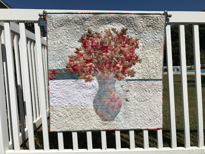
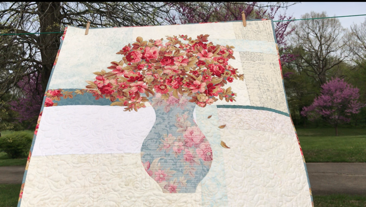
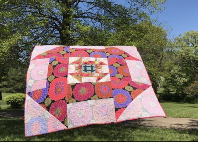
The rose bouquet quilt shown here is appropriately named Rose.
This Rose bouquet quilt was the first made in a series of bouquet quilts. Each quilt was as different and distinct as the focus fabric from which it was made!
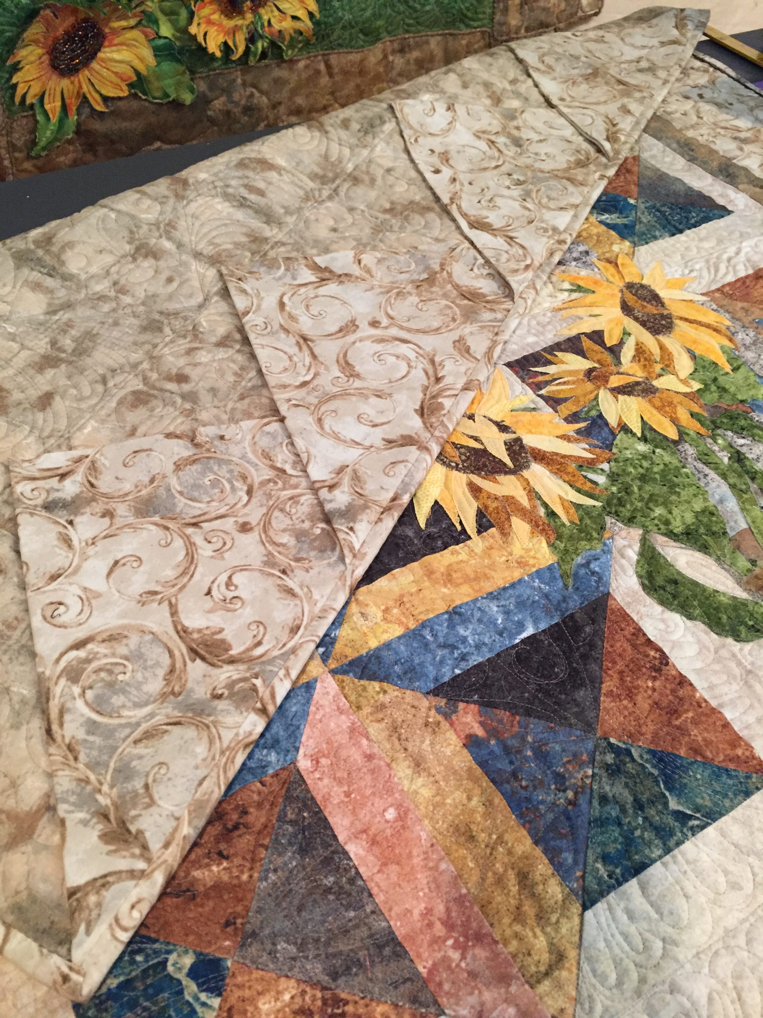
Rose is made with both beautiful sides of one focus fabric!
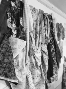
First, the focus fabric for this Rose bouquet quilt is Bed of Roses by Geri Robinson by Red Rooster Fabrics. It is used for the vase (REVERSE), the bouquet, and binding. Unlike other similar quilts, one accent strip in the background is featured in this quilt to demonstrate the contrast between the right and reverse sides.
The scroll work on the focus fabric for the Rose bouquet quilt doesn’t appear on the right side, but it makes a beautiful design on the vase when you use the reverse!
The key to making a Rose bouquet quilt is learning how to audition both sides of fabric. Value is the key! First, you will discover the nuances of value as you learn to audition both sides of focus fabrics. Likewise, once you choose your focus fabric, you’ll apply the same principles (tips) to audition background fabrics. It’s easy to audition fabrics when you know what to look for.
Basically, the Rose bouquet quilt is made using fusible applique and broderie perse techniques. Simply put, you’ll trace and cut the vase from a full-size paper template. Next, you’ll cut flowers and leaves from the motifs on the fabric. It’s as simple as fusing them onto the background fabrics. Finally, the applique can be secured during the quilting process, making this a truly fast project to make.
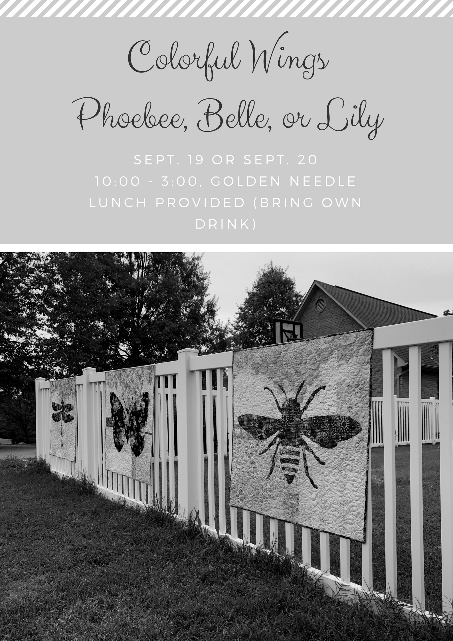
Phoebee, Belle & Lily
In conclusion, just like the quilts shown above, Rose is a fast, fun wall hanging which makes it a great gift or decoration for your home.
You know you’re a quilt enthusiast when your home decorating is based on the quilts you’ve made…or plan to make.
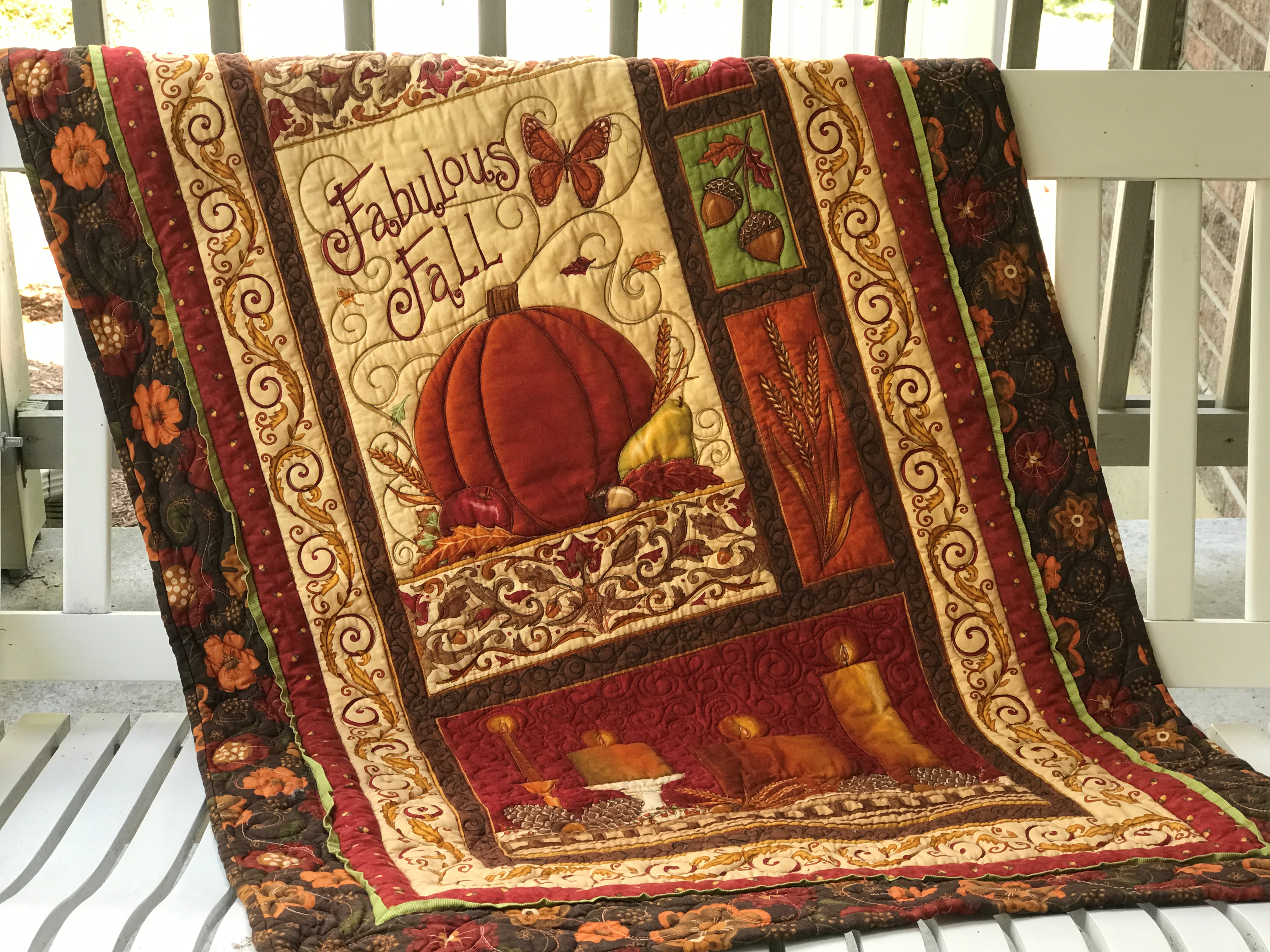
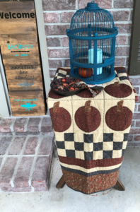
Write your blog post…write your blog post…write your–wait, I should get my fall quilts out for the front porch–no, write your blog post…well, I need to run downstairs to look up a password anyway, so I might as well just grab that one panel quilt for the swing…THEN I’ll write my blog post…hmmm, that old Thimbleberries baskets quilt would look nice here…I don’t use it in the house anyway and I’ll wash it at end of the season…oh, maybe the pumpkins one could go here…I really need to work on that blog post…its crazy how many quilts I have all over my house…hey, maybe I’m not alone…
So today’s blog post is about decorating with quilts! Do you? Decorate with quilts? And I’m not talking about hanging one quilt on the wall… do you immerse your house with your quilts? Maybe it is just me. It does seem kinda eccentric. Well, for better or worse, here it is–this is how my mind works when it comes to quilts and decorating:
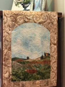
A few years ago, I had a vision, if you will, of an Italian landscape quilt and so…I repainted my kitchen (complete with break-away brick) in preparation for the quilt I was making. (Yeah, kinda backwards, I know.) Click here to see Bella Vista. Turns out Bella Vista inspired a whole line of quilts, wool applique, and punch needle for an Tuscan-themed book proposal. Two of those projects hang from tables right now:
Bella Tablescape features an arched window on either end of the table runner with a landscape scenery.
Bella Tablescape
Bella Piastrella (beautiful tile) is a pieced tile pattern with fused applique. Click here to see the whole quilt in this post about using flange.
Bella Piastrella means “beautiful tile” in Italian.
Now a Bonnie Hunter mystery quilt hangs in my kitchen (I adapted the colors and borders).
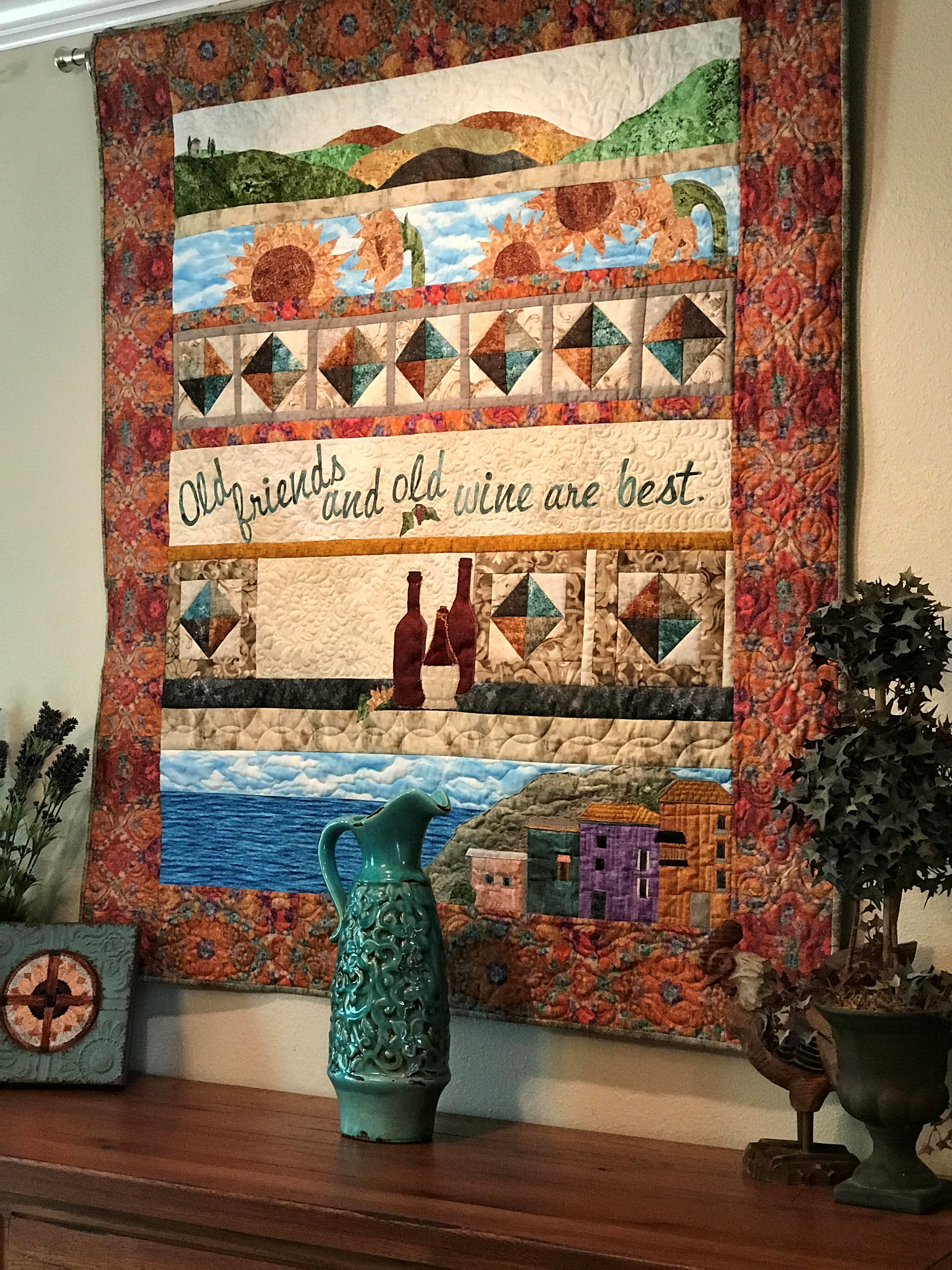
In my dining room hangs Italian Proverb, which was a row-by-row pattern I designed for promoting said book proposal. I felt quite accomplished cutting the letters for the proverb with my Scan N Cut.
Italian Proverb Row by Row
In our coastal-themed living room there are currently five quilts. Tropical Fun toured the AQS circuit a few years back in an Accuquilt display.
Tropical Fun made the AQS Accuquilt tour a few years ago.
Click here to see the others in my post, Summer Quilting.
Now for that one quilt I had on my mind, the one for my porch swing. A panel. Simple but great for a swing quilt because it wasn’t too involved or expensive (in case it blows away). Then there are the old greats from Thimbleberries club.
So, please tell me below that I’m not that weird and that you decorate with quilts, too! Or you can say whatever you want, but please comment!
In upcoming posts, I’ll show the rest of my Italian designs and introduce some NEW patterns using both sides of one focus fabric (it’s not just for winged-girls anymore!).
Sign up below to receive my posts (about one a week). Please share on Facebook and Pin on Pinterest! Thanks for checking in today.
Here are a few items you might want to add to your retreat list:
There are lots of lists out there suggesting what to pack for quilt retreats. Here are a couple of things I add to the basic lists – to update them or accommodate for my projects. Hope this will help you, too, be totally prepared for your next retreat.
Okay, so first, take all the normal sewing/quilting supplies (machine, fabric, thread, needles, scissors, seam ripper, etc.).
Then consider:
Chargers for phone, Ipad and Fitbit
Cords for all machines and laptop
Leather thimble or little stick-on dots for hand-work
Chain-cutter (mine is Barney purple)
Guild directory (for when you can’t remember that one lady’s name)
Pre-cuts guide (for shopping trip)
Pressing board
Silicone Pressing Sheet
Extra light bulb for machine
Basting glue
Pressing Spray
1/4 inch guide
Extra lighting
Water
You might want to throw in some clothes and soap and you’re good to go! Now check out thisOne Sweet Retreat to read about last year’s trip to Jonas Bluffs.
Please share your ideas for retreat lists and comment below.
Choosing fabrics for quilts isn’t hard, but it can be tricky.
Choosing fabrics for quilts involves auditioning the color, size of motif, and value of the fabrics. I have long thought I understood the value of fabric values. Value is what makes, say, a simple, two-color quilt have bold areas of light and dark. Value also makes those cool secondary patterns in your multi-color quilt design appear like magic.
Easy, right? I thought so. However, a few years ago (actually about 20 now), Blended Quilts became popular. I became mesmerized by blended quilts. I bought the books and studied them, reading about fabric choices and how to combine fabric values to work together, while not being too obvious. Turns out, I never did really “get” it. It was too hard for me to look past the floral motifs and colors. Thankfully, our guild had a program presenter who sold blended kits! Problem solved (for the moment).
Turns out, choosing fabrics for quilts based on value can be tricky!
For the record, I love all kinds of quilts.
Karla
My Grandma Emma Wichern’s lavender and white embroidered quilt is precious to me. Simple, clearly defined values. But I also love those wild “crazy-quilts” which practically shout in all dark values. Modern is fun, bright, and happy…or sometimes calming and simple. I have a passion to some degree for all types of quilts. But what really gets me excited about a quilt is when it is successfully splashed with all kinds of rich, colorful and different fabrics…and it works! Value is what makes the magic happen in those quilts.
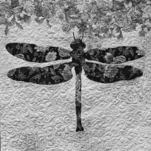
To truly know the value of fabrics, you have to remove the color.
You can do this numerous ways, but the simplest trick for me is to take a picture of fabric choices or my blocks on my design wall with my phone and change the picture to black and white (mono or noir). Colors and motifs can fool you. For us quilters, fabrics aren’t just fabrics. They evoke emotion (usually happiness). I used to fall in love with a fabric, or line of fabrics, and be determined to use it because of my emotional connection. Consequently, I’ve made some quilts that turned out okay, but had the potential to be brilliant.
When choosing fabrics for quilts, remember that values change depending one their surroundings.
That’s the tricky part! A quilter once said, “My Light looks too dark when I use that light of Medium.” Okay, that was me who said that, but it’s true! And, it can be tricky.
Light. Medium. Dark.
The fact that my neat little piles of lights, mediums, and darks can change their values, depending on what is around, them was a “V8” moment for me!
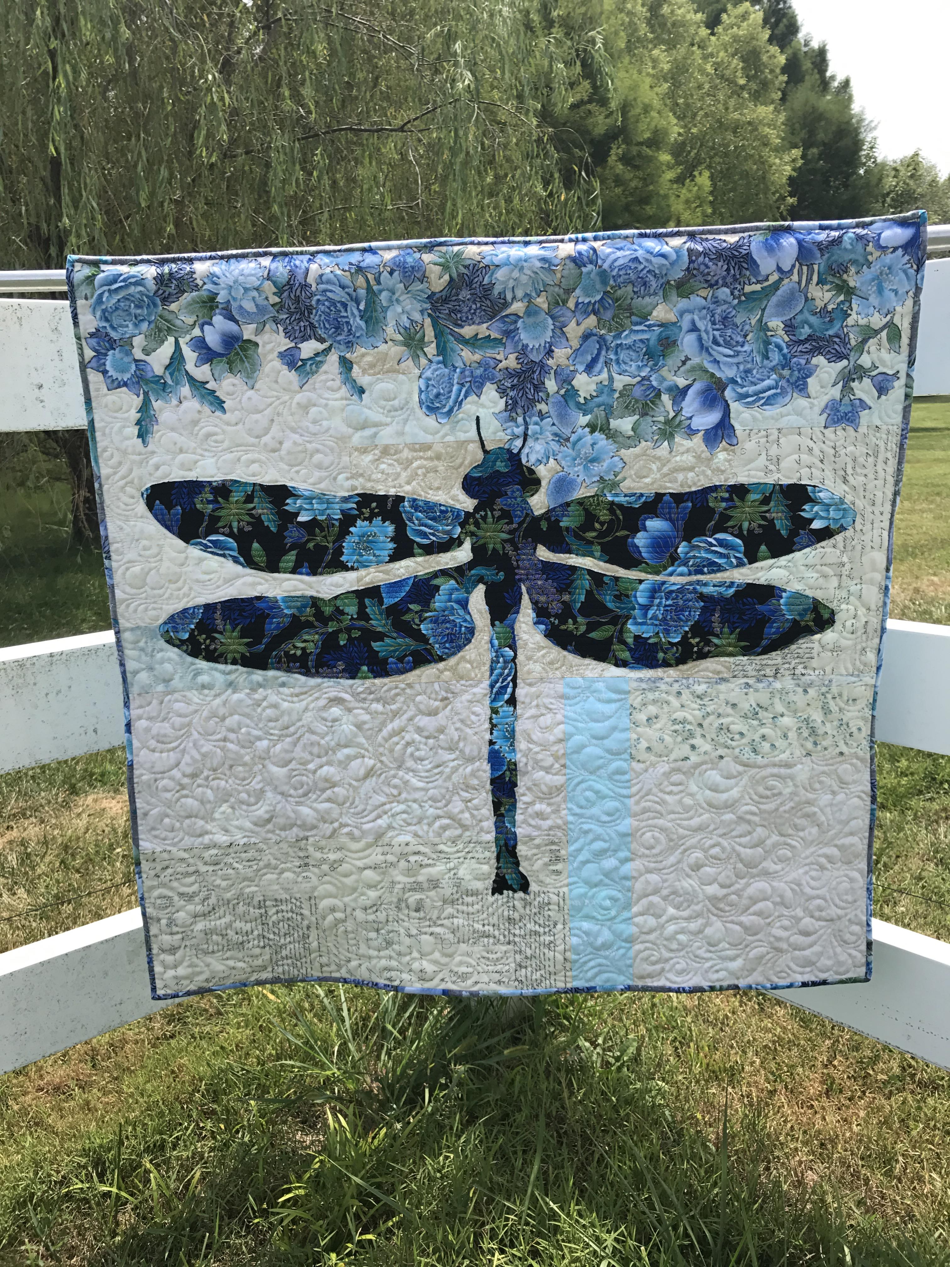
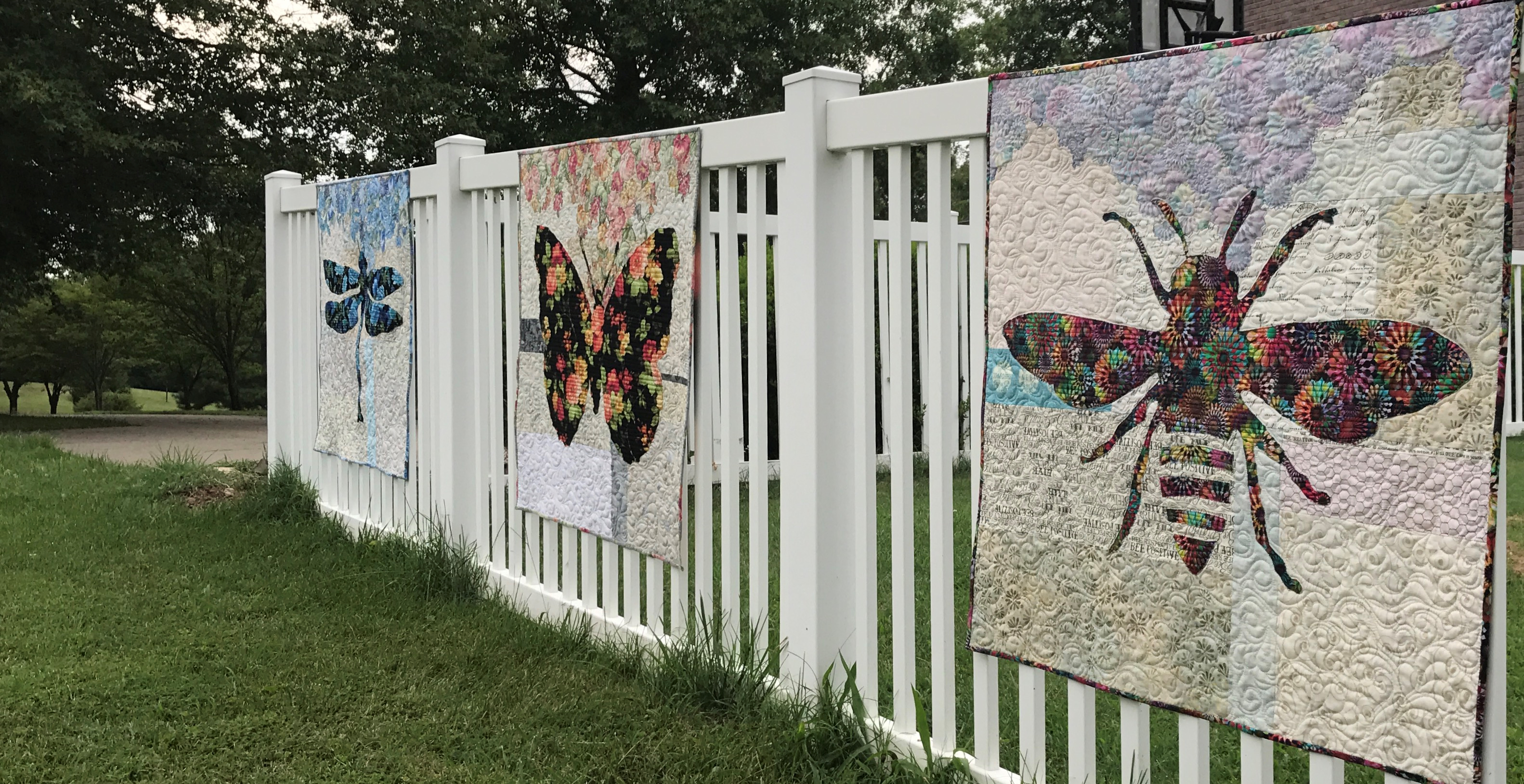
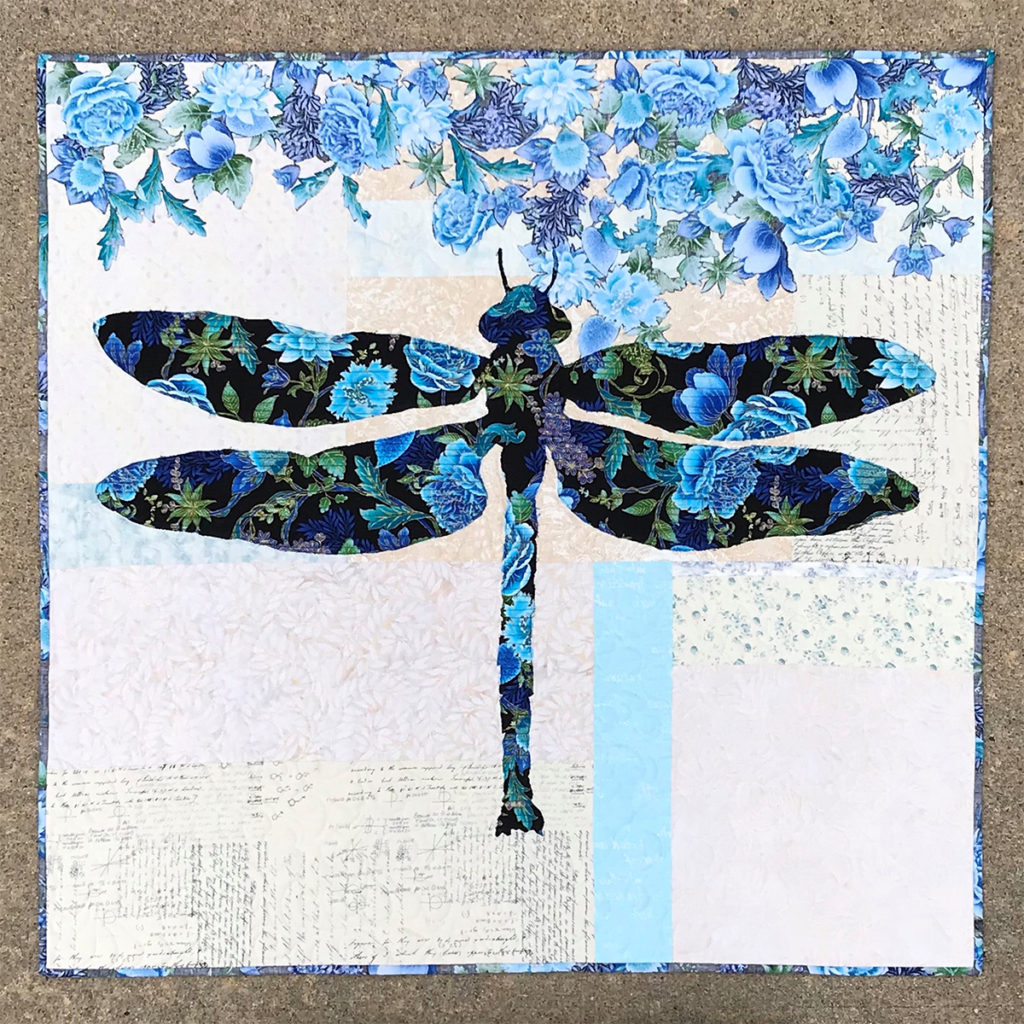
Let’s look at this dragonfly quilt for an example.
Lilly’s background is made of scrappy, light neutrals with a couple of colorful accent strips. The background is light when compared to the dragonfly focus fabric. The flowers at the top of the quilt are made from the reverse side of focus fabric. The flowers “read” as a medium value. Clearly the dark value of the dragonfly is what you notice first. The flowers are secondary. The various background fabrics catch your eye last and allow your eyes to linger on them.
When you are just working on your background, those strips of color can look quite bold and may seem too dark to be part of the background. But when looking at those same fabrics in black/white WITH the focus fabric laying across them, they all fall into the light category and they work!
Even the colorful accent strips disappear in this black and white photo.
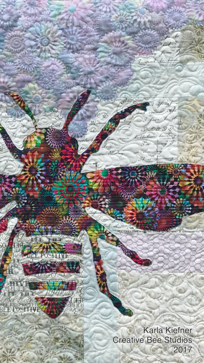
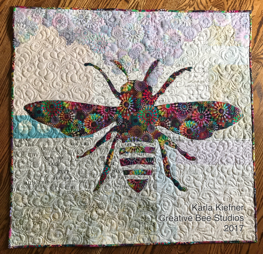
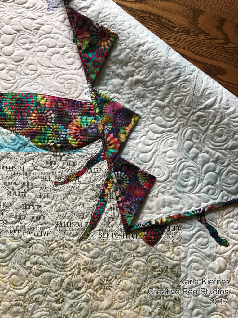
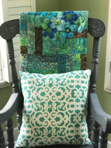
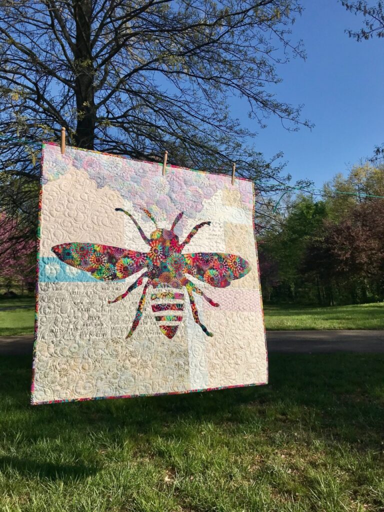
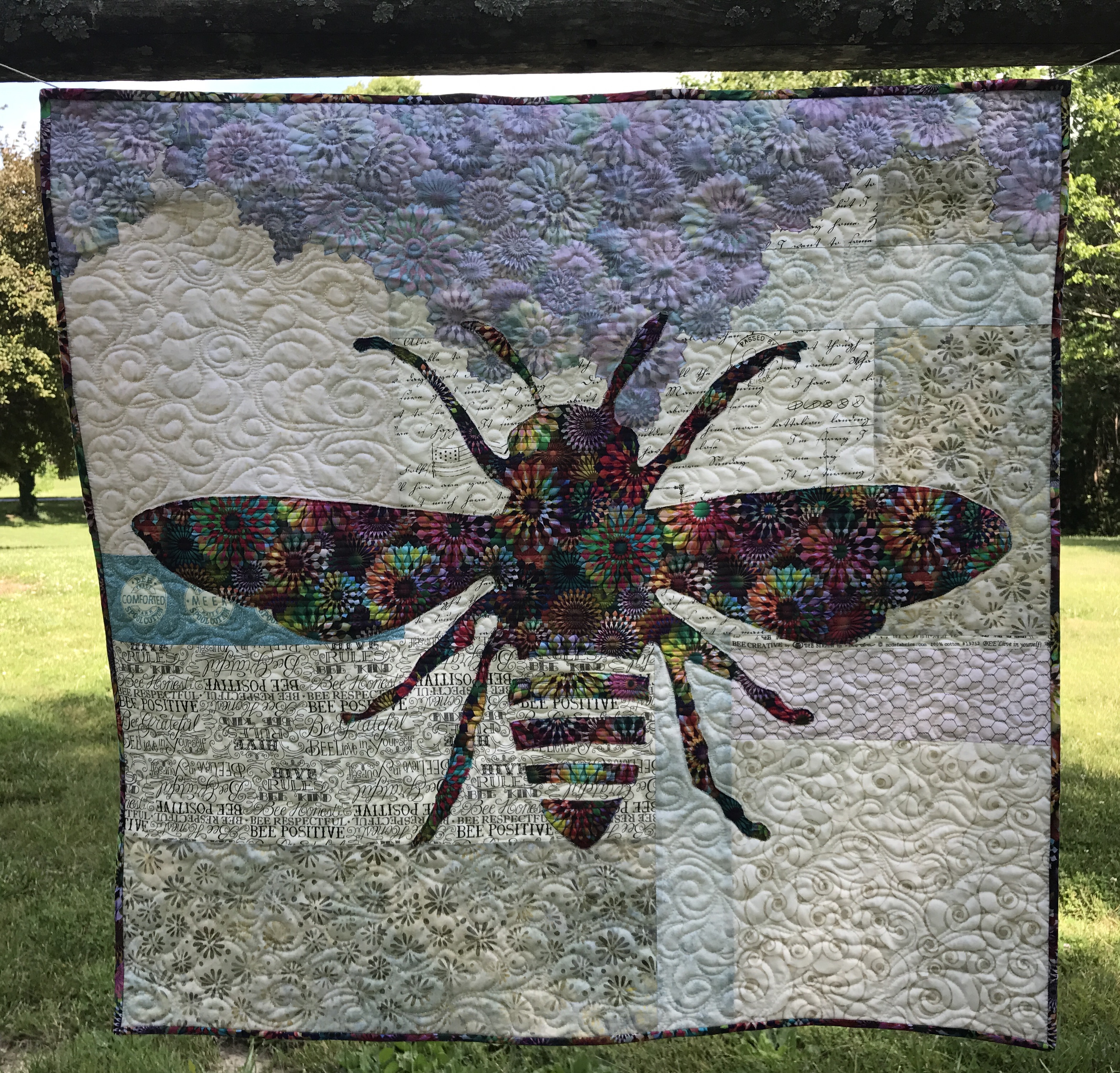
Phoebee is made with both sides of one focus fabric on a scrappy background. Choosing fabrics for this quilt is how I first learned the nuances of value. Using both beautiful sides of fabric taught me that lesson.
Notice that the boldness of Phoebee’s focus fabric allowed for a variety of values in the eclectic background. Phoebee is clearly the “buzz” of this quilt!
Next, lets look at Belle, the butterfly quilt.
Again, the RIGHT side of the butterfly focus fabric has a dark enough value that it can “handle” a lot from any background fabrics, including the accent strips. However, the REVERSE of the flowers made from the same background fabric are medium to light in value. Some of those flowers might have been lost if the value of the background fabrics were too similar.
In conclusion, choosing fabrics for these quilts might be a little out-of-the-box for some quilters, because they call for mixing so many colors of background fabrics. But if you follow this guideline it’s easy: If the value is right and you like the fabric, use it. It’s freeing to combine lots of “styles” of fabrics, like miniature prints, batiks, grunge and more! I encourage you to combine a variety of fabrics in your quilts. Remember, it can be fun choosing fabrics for quilts, when you take the guess work out of it.
It’s the combination of background fabrics that make these quilts sing!
Classes starting in September. Patterns available now.
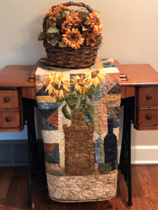
After being inspired at quilt market (See Six Favorites from Quilt Market), I knew I wanted to mix lots of different fabric types to make a bee quilt. While I thought the shape of the bee would be “in the mix”, the background is actually where I used a variety of styles of fabrics:
chicken wire fabric from the 90’s, inherited from my mother-in-law, Pat, (love)
My Crystalia fabric became my bee. Her flowers I made from the “wrong” (such a harsh word) side of the same fabric.
I guess you could call the flower technique a “modern broderie perse” (thank you, Kelly). They are made with simple, fusible applique and are cut without fussing about the edges – in fact, I encourage letting background show through as it ties the two sides of the fabric together in the quilt.
In my classes and in my patterns, I point out that all reverse sides of fabric are not alike — audition your front AND back sides with your background fabrics.
The best way for me to describe a good reverse side is to say that it should “sing” just as much as the front, just with lesser value.
Phoebee
One thing I liked most about Phoebee was that she seemed to be getting her life and beauty from the flowers. Thanks to the hubby for her name–which in Greek actually is spelled with two “e’s” at the end and means “bright, pure”.
Next came Belle. She’s a French butterfly. Belle means “beautiful” (I NEVER got that about Beauty and the Beast – blush).
I found Belle’s fabric, Estate Gardens by Andover at my local quilt shop, The Golden Needle. I used similar neutrals in her background, but stayed with different shades of gray (some reversed) for the accent strips. Her binding is made with the reverse side out.
Note: I like to mix all shades of neutrals – white whites, beiges, off-whites- and all types of fabrics like tiny prints with batiks and novelties.
Last but not least, meet Lily.
Lily is a sweet dragonfly made from Tree of Life fabric by Chong A Hwang for Timeless Treasures, also found at my local quilt shop. Her background accent strips are in aqua because a) that’s my favorite color and b) I wanted to connect her to the water locales dragonflies love.
Visit my Etsy page or The Golden Needle for patterns. If you are interested in weekend or evening classes, let me know in the comments below.
Next up is a review of value, very helpful for auditioning fabrics for Colorful Wings quilts! Don’t miss a post – sign up below for email notification! Thanks so much for following. Karla
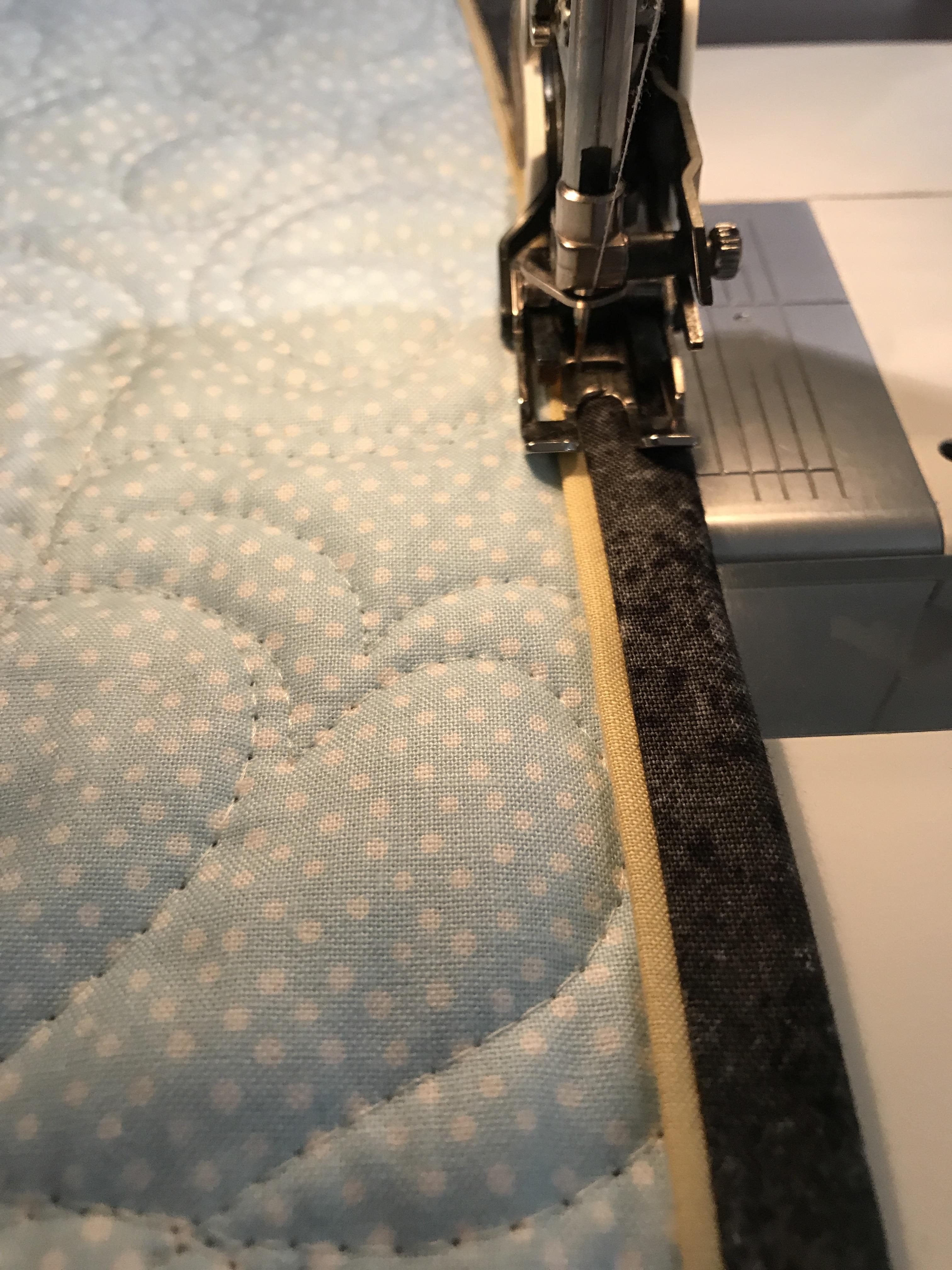
When time and cuteness matter, this Lickety-Split Quilt Binding is the binding for you!
The Lickety-Split Quilt Binding technique for finishing quilts is helpful, time-saving, and attractive. By nature, it aids in a more perfect machine-attached binding for your quilts. Here’s how:
The binding is made by combining two differing strips to make the binding. One acts as an accent that appears next to the quilt. The accent looks like a flange or piping along the edge of the binding. And, here’s the best part, the accent doubles as a stitching guide. You’ll attach your binding to the back of the quilt, turn it to the front and stitch in the ditch of the accent and binding fabrics. When you use a bobbin thread that matches your backing, your finished product has a clean stitching line along the edge of your quilt backing.
I originally saw this idea years ago on Pinterest. This method produced a wider binding than is generally used these days. I’ve adapted the idea several times to product a variety of sizes, based on your needs. I don’t consider Lickety-Split Quilt Binding for all my quilts, but there is definitely a time and a place for it! I’ve used this technique of binding numerous times. It’s great for things like utility quilts, baby quilts (the ones which will be well-loved and get lots of use), seasonal quilts, table runners, etc. I’ve used it on several seasonal quilts, which see the light of day for about one month a year and therefore don’t need a hand-turned binding.
Here is the original pin for this binding technique. I wish I knew who Susie was because I’d like to personally thank her for this binding idea!
The best part about this binding technique is the tiny burst of interest you achieve with the accent fabric. This strip gives your needle a perfect nesting spot for stitching it down by machine.
Lickety-Split Quilt Binding finishes at either two and one/fourth inches or 2 inches. I like the smaller size for smaller art quilts, table runners, and wall hangings.
Binding technique for when time and cuteness matter.
Cutting Guide:
2 1/4 inch binding:
Main binding strip: 1 1/4″
Accent strip: 1 1/2″
2 inch binding:
Main binding strip: 1 1/8″
Accent strip: 1 3/8″
Simply cut your strips and sew them end to end and press like normal binding, but do it for both colors.
Then sew the two long strips together, press seam to the binding color.
With the seam facing down, align the edge of the binding along the edge of your quilt and stitch a 1/4 seam (or smaller than your final stitch seam), connecting the ends with your favorite method. Lastly turn your binding to the front of your quilt and stitch in the ditch between the two fabrics. I like to use a seam guide and move my needle to a comfortable spot.
Note: I have not used this method on show quilts or nicer quilts which call for a hand-turned binding. I did notice at our last guild show that one of the quilts in the winner’s circle (triangle) had a machine-attached binding, so it’ll be interesting to see where the quilting world goes with this!
What’s your favorite binding method for fast quilts? Tell me in the comments below. Sign up below for notifications and you’ll never miss a post.
Stay tuned for some exciting news from Creative Bee Studios!
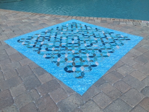
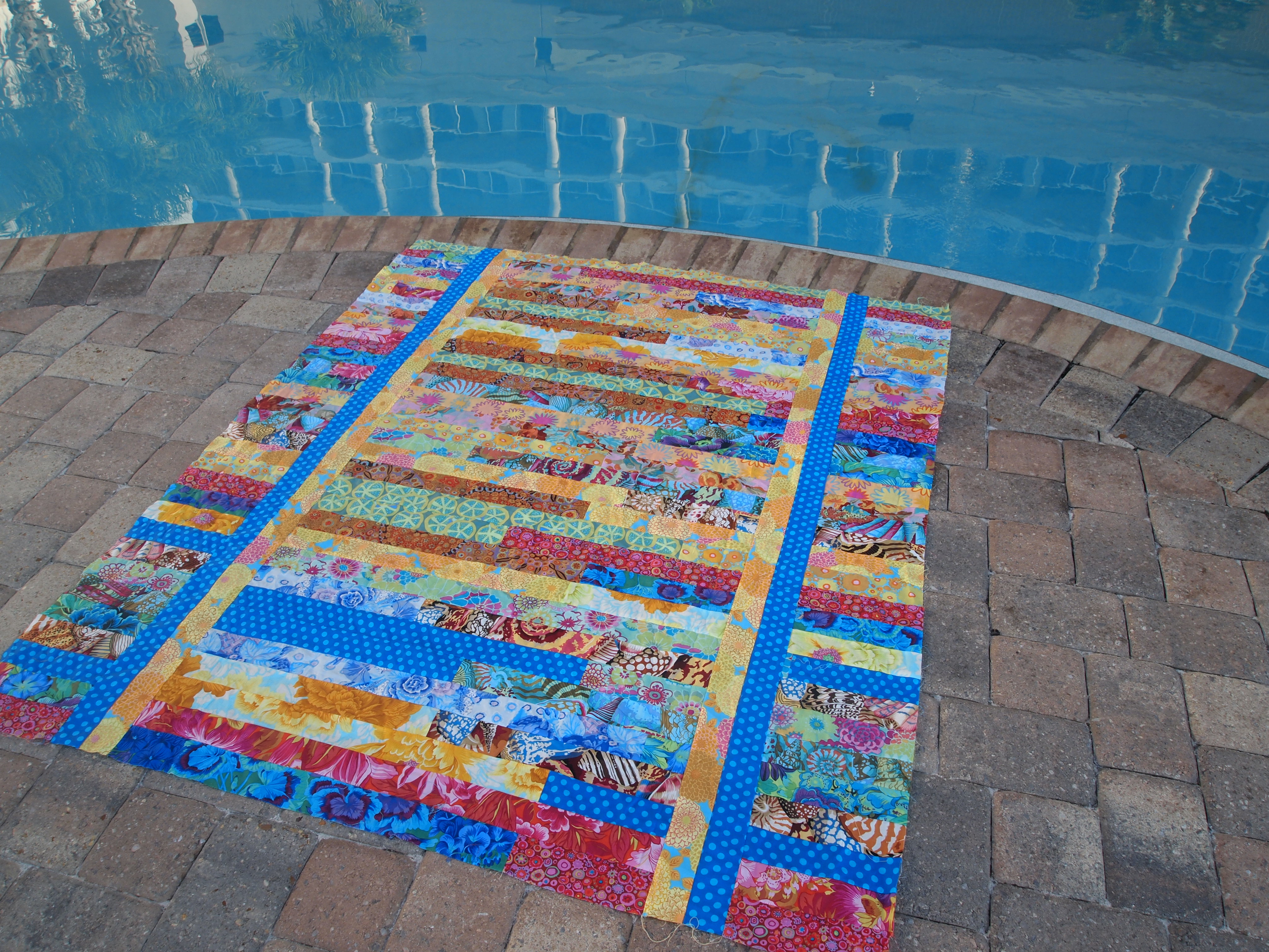
Summer-themed quilts are one of my four favorite seasons to quilt!
I really don’t have anything against the other seasons…but summer is my absolute fave! Maybe it’s because I grew up camping and water-skiing all summer long, every weekend from Memorial Day to Labor Day then for two weeks at Table Rock Lake. My friend, Annette, and I would go from one dad to another to beg him to ski us until we wore one of them down. The memories I have of sliding across the lake water, singing “Summer Breeze” at the top of our lungs while we’d double-skied are unforgettable. We’d love to go first thing in the morning before any ski boats were out but the fishermen were well in their coves, when the water was as smooth as glass. It was only this year, when I was reminiscing with my 90 year-old dad, that I realized that all those times they said their boats weren’t working they were just trying to move us along!
Water Colours
When I got a summer job, it was at a city pool — for eleven summers. I’d ride my bike across town to work, starting as a “bag girl”, teaching swimming lessons, becoming a life guard and eventually the manager. I had a pretty darn good whistle twirl, I’m telling ya! My friend, Patti, and I had the magical “Summer of Grease” and went through countless coins at the concession stand and at least three swim suits a summer from the hours we spent there almost everyday. The quilt above uses a background fabric which looks like the bottom of the pool when you’re swimming laps and the sun is shining. I just love it!
Tropical Trip/Quick Trip by Eleanor Burns
As a mom, I always loved when the kids got out of school for summer and never understood why people wanted summer to end and school to begin. I just have a thing for summer, sunshine, warmth, and water, I guess.
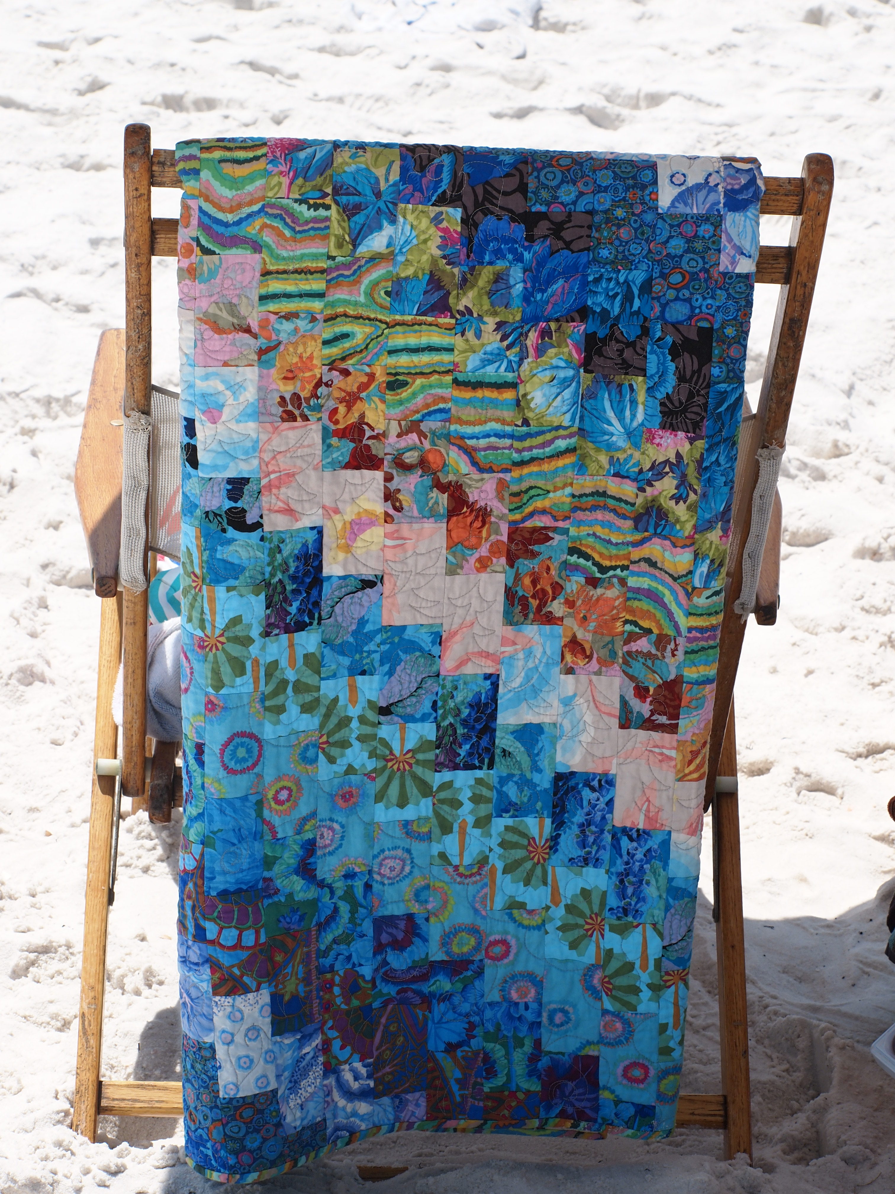
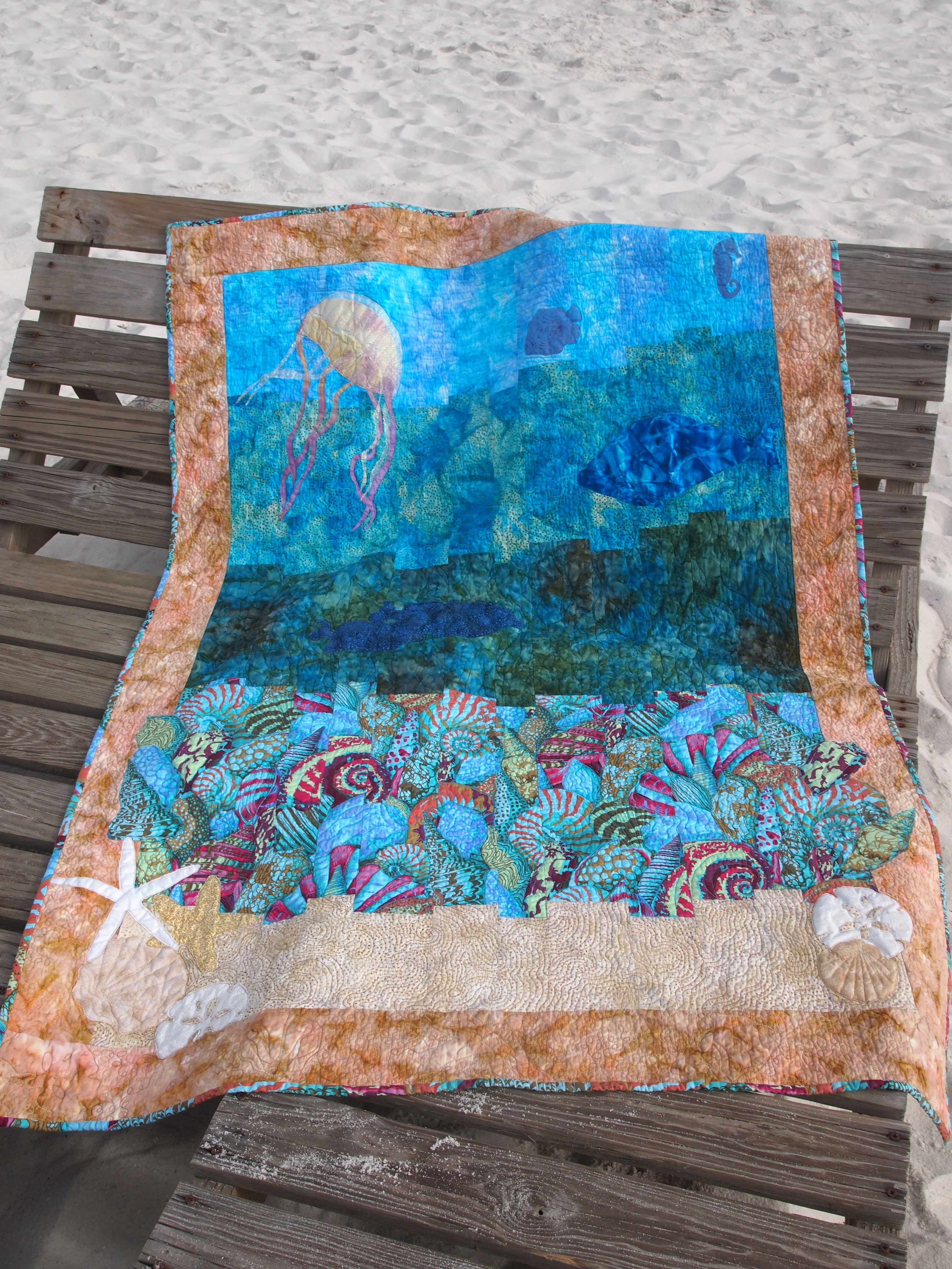
So I guess it’s not too surprising that summer shows up often in my quilts. When we get to vacation at the beach, I take my quilts for photographing and my Featherweight for sewing. See Pensacola Dreamin’ for more quilting at the beach!
Vintage at the Beach
Jacq’s Potato Chip Quilt
I believe there is nothing like water in the background to make a quilt sparkle.
Seaside Dreamin’/Instant Bargello Quilts by Susan Kisro
Do you like to certain projects in the hot summertime? Tell me how you spend your summer stitching time. Comment below.
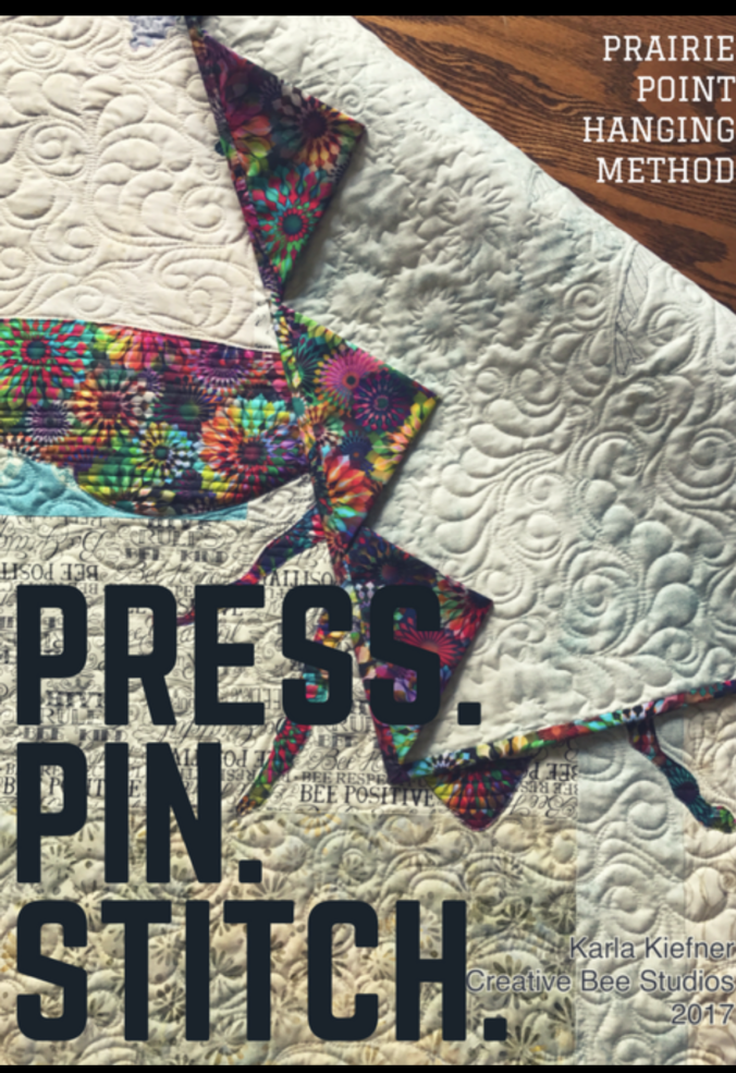
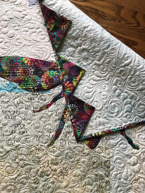
Use pretty prairie points and just a couple of hand-stitches to hang your quilts.
The Prairie Point Hanging Method is as easy as 1, 2, 3…4 stitches!
1. Fold and press fabric squares diagonally, twice, just like you would when making prairie points.
2. Pin the raw edge of the prairie points (triangles) at the top edge of the back of your quilt, spaced evenly.
3. Baste across the top of the quilt by machine and make four stitches by hand (with doubled thread) on the points of each triangle, making sure you only stitch through the backing and batting.
It’s EASY, FAST, and PRETTY! Click here to see this quilt.
Prairie Points Hanging Method
Adjust the size and number of your squares based on the width of your quilt. For example:
Four 7-inch squares make prairie points for a 24-inch wide hanging.
Four 16-inch squares work well for a 48-inch quilt and easily accommodates the largest requirements for our quilt show standards. Simply add more of the same size prairie points for a bed-size quilt.
Bella Piastrella with Prairie Points Hanging Method
TIP: For small wall hangings, use an even number of prairie points and you can hang your quilt from a single nail or hook instead of leveling it between two points.
How do you hang your quilts? Share in the comment box below.
Scroll down to sign up for email notification and you’ll get a notice when a new post goes live (about once a week).
Thanks for checking out by my blog. Please share, pin, and tell your friends!
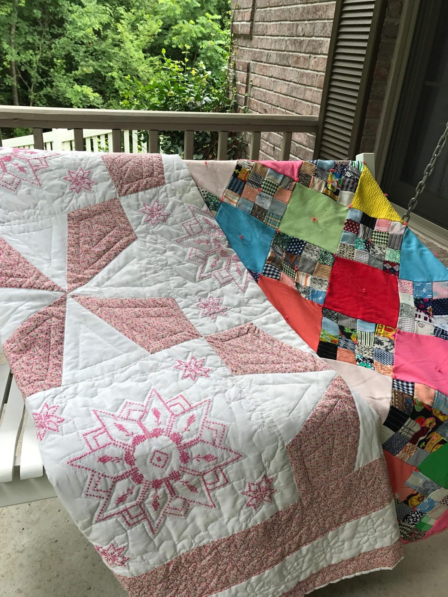
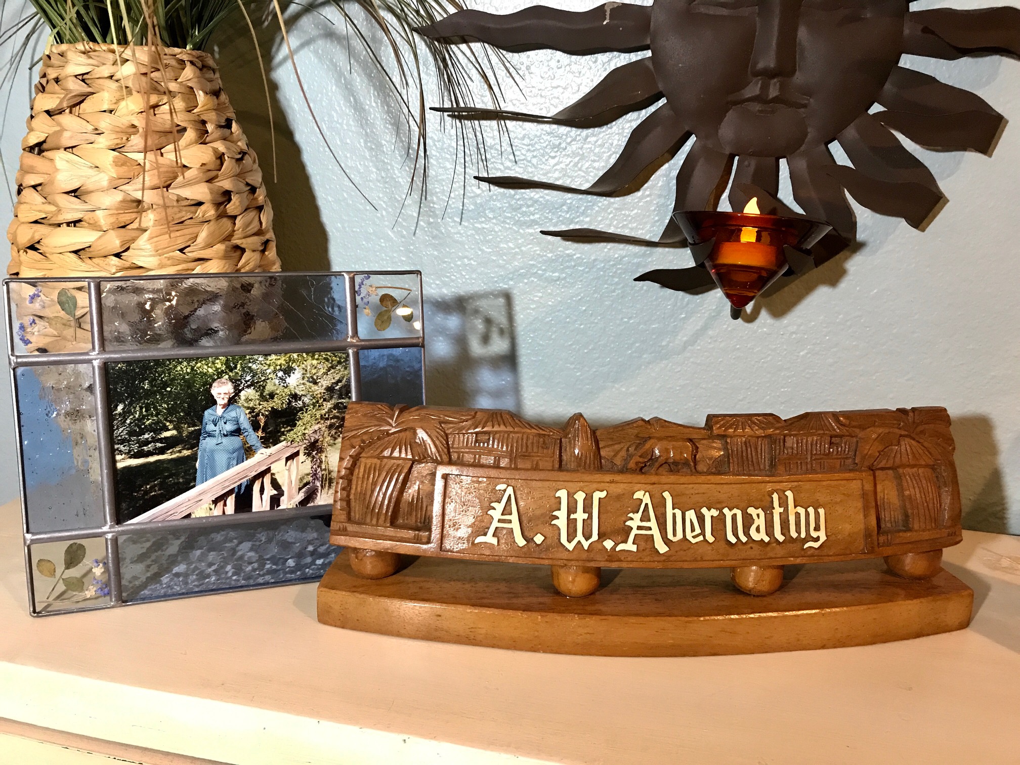
These are my wedding and graduation quilts from Grandma Ruby.
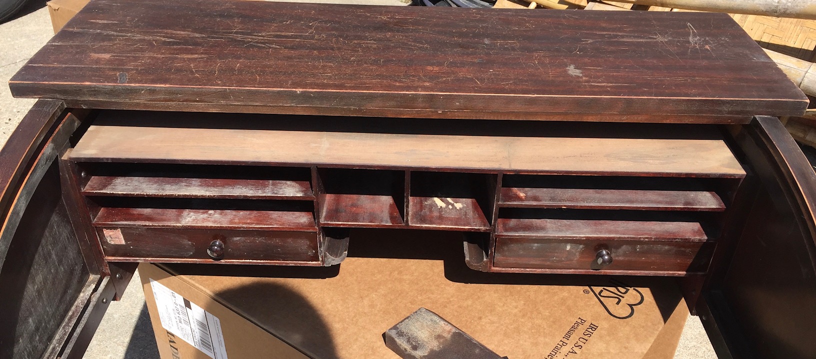
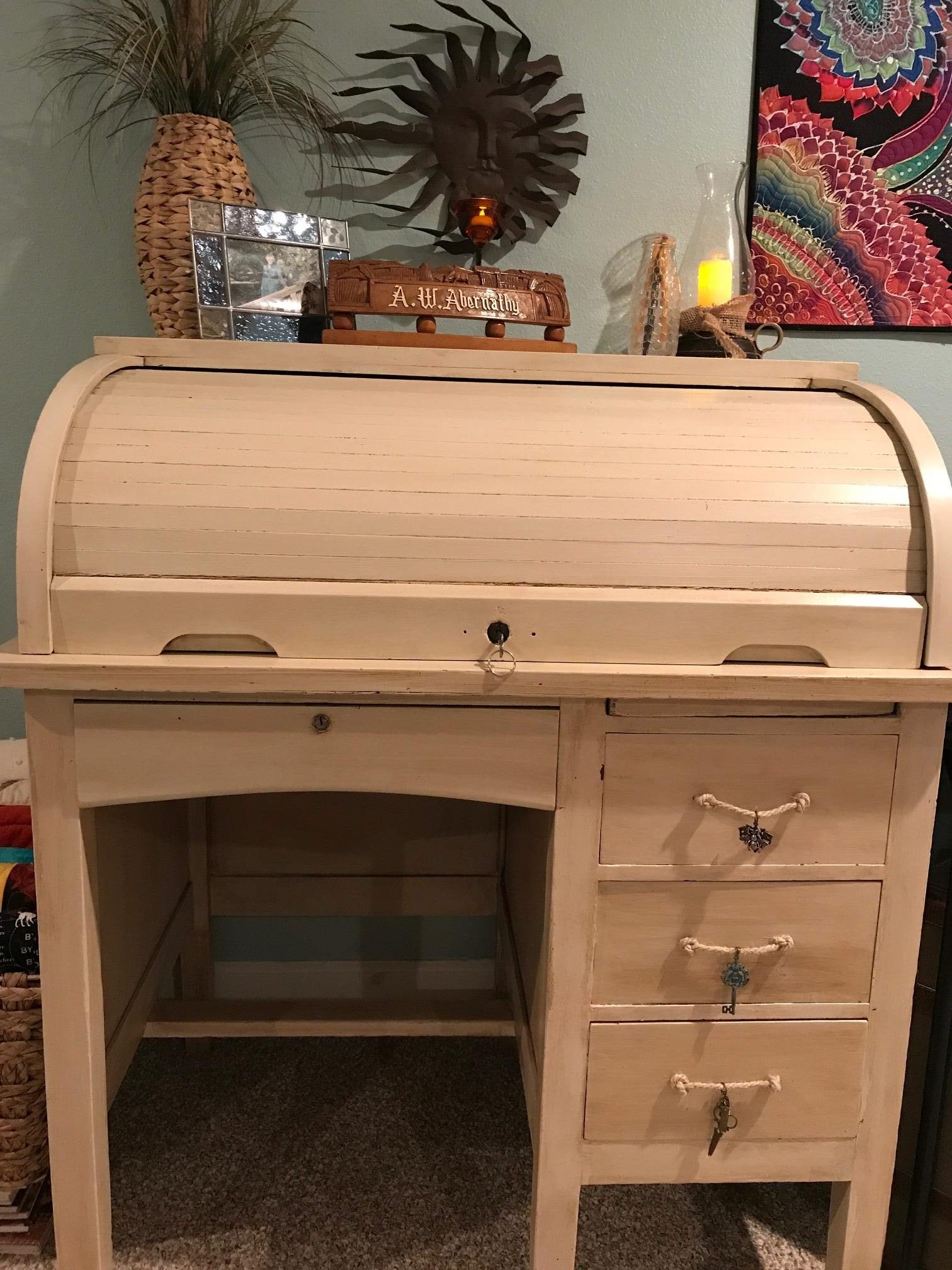
My grandpa ran his whole cross-road trucking company from this tiny roll-top desk. It is from here that he wrote out his invoices, paid bills, signed contracts, and wrote paychecks. I’m told his drivers had to wait next to the desk while grandpa wrote out their paychecks. It is from this little desk that my grandpa supported Grandma Ruby and their twelve (yes, twelve) children.
There’s barely room for a laptop…of course, he figured in his head and on paper. There are tiny drawers and slots. What did they hold? They aren’t large enough to hold a piece of copy paper. I assume he had a 5 x 7 inch booklet of hand-written, carbon-copy invoices.
I remember this desk being in the “pink room” in the middle of the house on Walnut Street (which was formerly a funeral parlor). This desk was in the same room as the black rotary telephone and grandma’s large quilting frame. Grandma made lots of utility quilts from polyester (I got the one pictured for my graduation), but she also cross-stitched and pieced cotton quilts which were hand-quilted.
These are my wedding and graduation quilts from Grandma Ruby.
While she herself was unable to quilt this cross-stitched quilt she made for my wedding, I cherish it just the same. Do you think maybe her favorite color was pink?
The desk, stained dark brown, had numerous scratches on the outside– maybe from moves? There were also lots of scribbles on the sides which help me imagine the noise and activity that surrounded grandpa and grandma in a home with twelve children.
There’s a lock and key for the roll-top and what is really cool is that when the top is down, all three side drawers are locked by way of a piece of wood in the back of the drawers with three nails sticking out. As the bottom of the roll-top moves upward to roll over the desk, it releases the piece of wood to lock the drawers in place.
I refinished this desk with antique white chalk paint and a nutmeg antiquing.
I like to imagine it’s like something Nancy Drew would’ve used!
I’m so happy to have this desk and am honored to write this post from the little desk that supported a family of fourteen!
Tell me about where you work. Do you have cherished family heirlooms in your home? Please comment below.
Sign up for email alerts when a new post goes live. Thanks for following!
Phoebee was designed using both sides of a focal fabric.
In this quilt, I used the front AND reverse side of its focal fabric.
How do you design a quilt? Do you use graph paper and draw out the design with exact proportions? Do you use color pencils or do you label the drawn areas with the colors of fabric or values you’ll use? Do you use a quilt design software or a tablet quilt design app?
Yeah…not me. A quilt often comes to life in my head… very vaguely, kind of like a mystery unfolding. I ponder the idea until I start to pull fabrics from my stash and start cutting, drawing, and stitching. At least, that’s how Phoebee came to life.
Phoebee was designed using both sides of a focal fabric.
Phoebee began with a vague idea to use pieced scraps from my stash for the background and use a bee as the main design. That’s about all I knew. I thought I wanted to use multiple fabrics for the bee as well. I knew the shape I wanted to draw out for my bee, but I wanted to get my background set first for size.
I did use graph paper in my process, but it was after I stitched my pieces together and decided I liked the look. That’s when I wrote down the dimensions and drew the shapes out, labeling which fabrics I used. I used a pencil because my drawings and placement of fabric changed several times in the process.
Once I was happy with the background, I made all my notes and could hardly wait to grab fabrics to design the bee.
NOTE: I don’t clean up ANYthing while I’m in creating mode — I just let it flow and fabric is everywhere!
So here I was, sitting on my floor (because my design wall was {and still is, truth be told} full of a bed-size quilt in progress), trying out fabrics, figuring out how to combine them to make an interesting bee, when one fabric just kept jumping out at me. I finally gave in and decided to use it alone for my bee. That fabric looked really good against the pieced background.
But something was missing. I liked the bee. I liked the background. There needed to be another element – something of surprise or interest and something to “ground” the bee somehow. I moved the extra fabrics aside and accidentally turned the “bee (focal) fabric” upside down — now THAT was interesting! To use the reverse side of the focal fabric for the flowers the bee was pollinating was exactly what this quilt needed to make sense, be unique, and complete the “story”.
Phoebee means bright, pure in Greek.
Phoebee means BRIGHT, PURE in Greek and she is both! I happened to use a color-dense Hoffman Spectrum Digital floral print for the bee, the flowers and the binding, but any floral, big or small would work which makes this a great stash-busting quilt.
I like the idea that Phoebee is vibrant and the flowers are softer in value as the bee is getting its life from the flowers.
I’m excited to finish writing this pattern and I have hazy plans in my head brewing of additional designs using pieced backgrounds and one floral focal fabric.

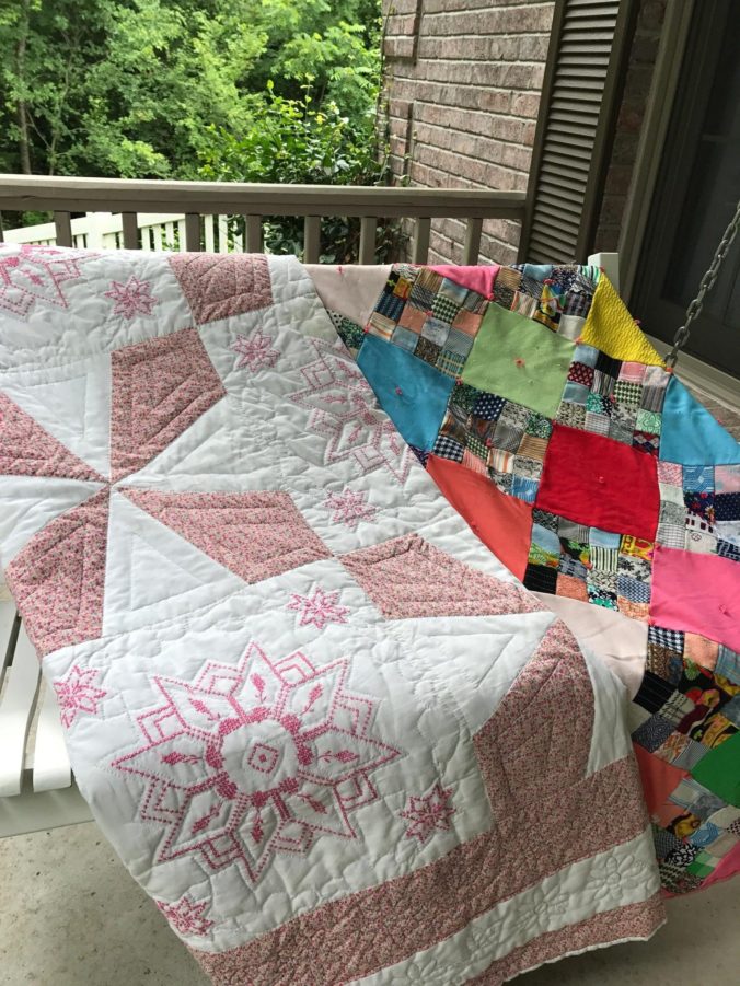
 Then there are the old greats from Thimbleberries club.
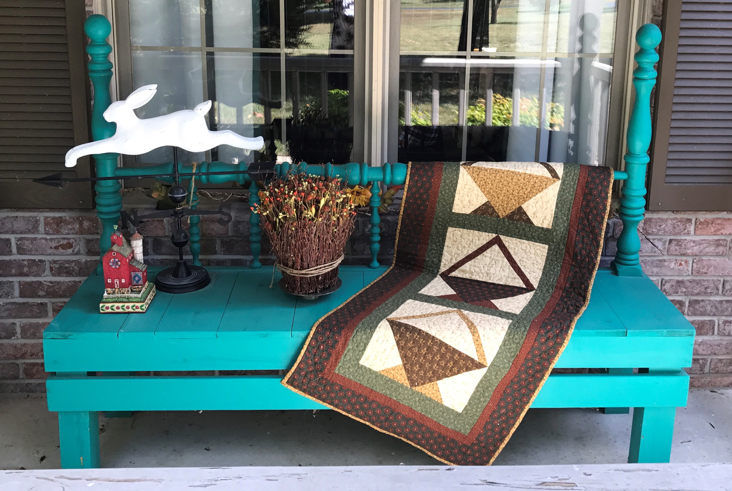
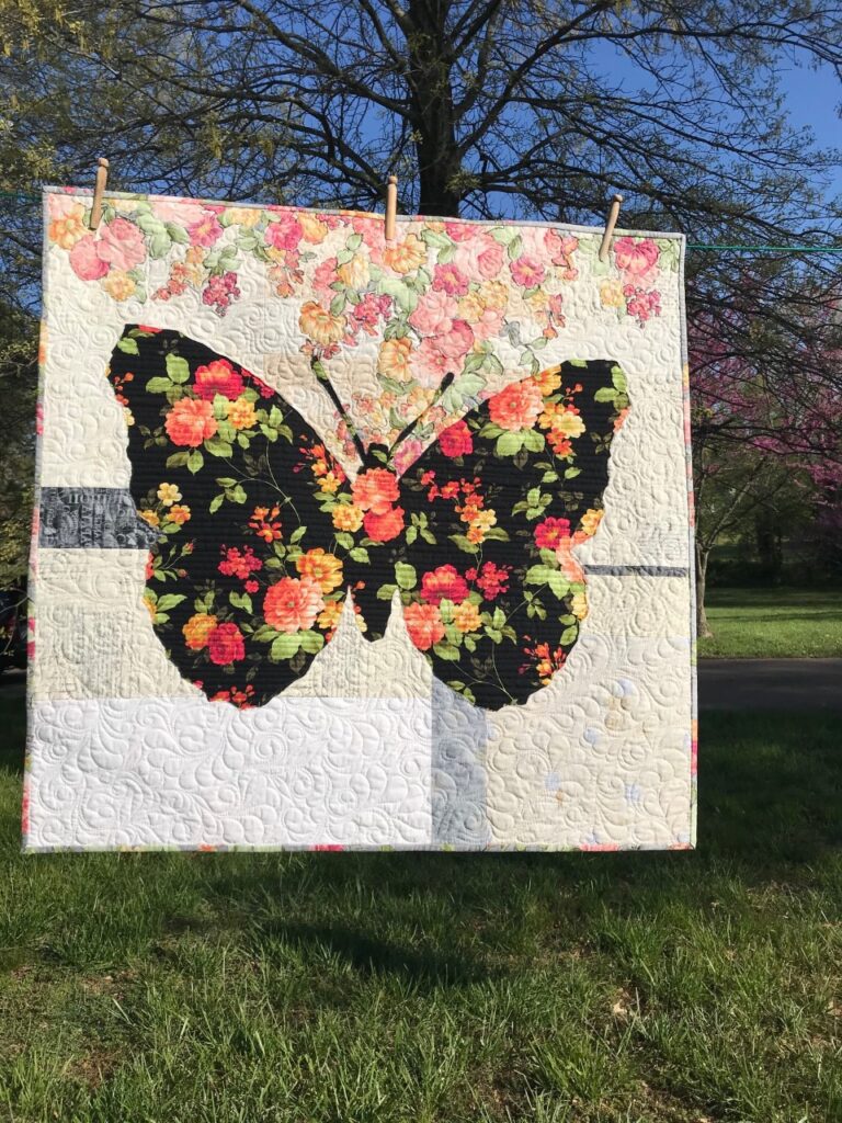
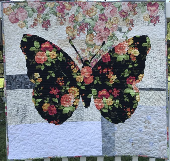
 Next came Belle. She’s a French butterfly. Belle means “beautiful” (I NEVER got that about Beauty and the Beast – blush).