Estimated reading time: 5 minutes
Table of contents
- Learn how to overcome the mysteries of value. It’s easy!
- Test your values.
- So how do you remove color from fabrics you are auditioning?
- The best way I have found to truly see the value of a fabric is to take a black and white picture.
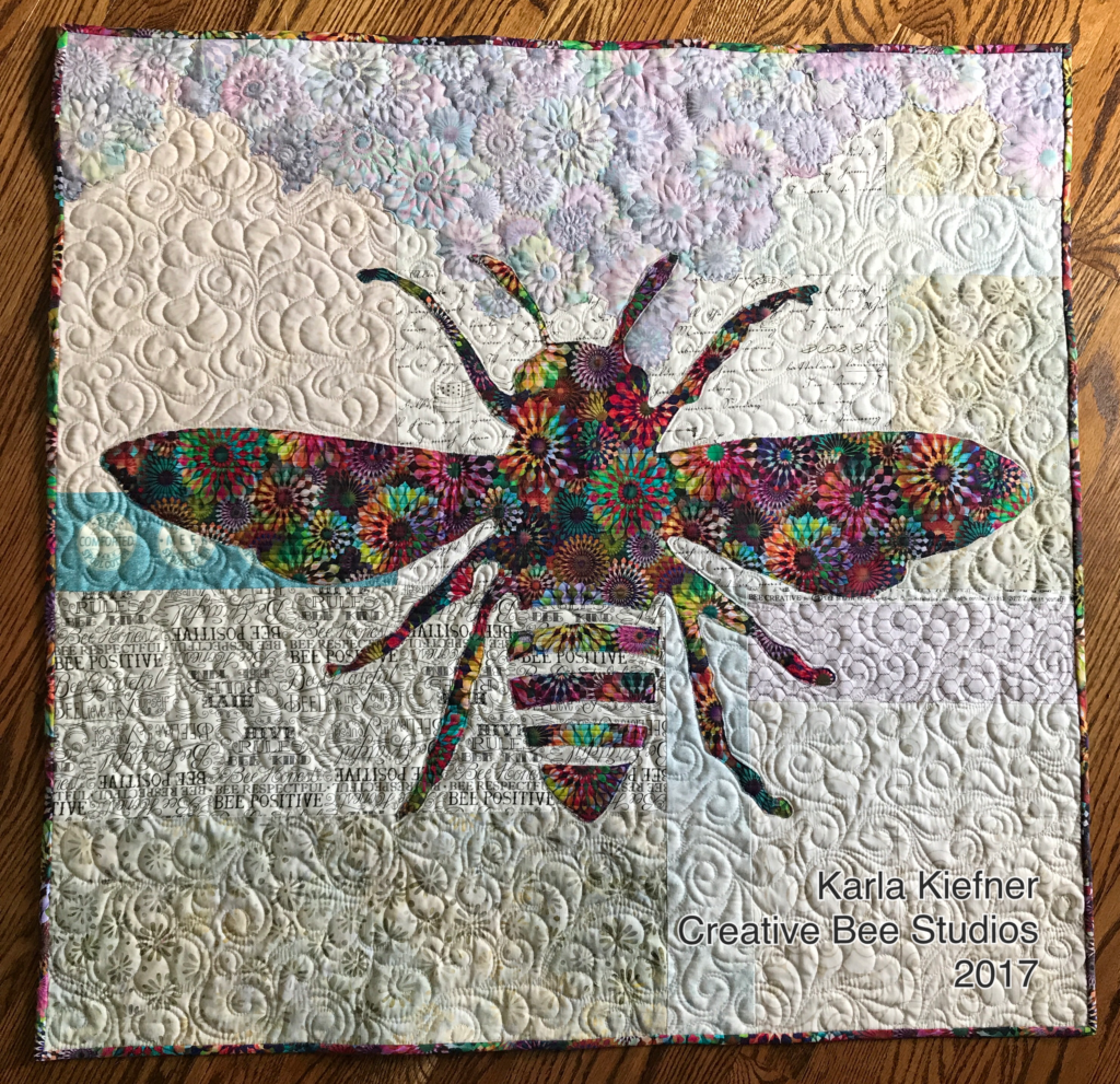
- Now you know the how-to tip for determining value. Why not have fun practicing on a quilt made with BOTH beautiful sides of fabric!
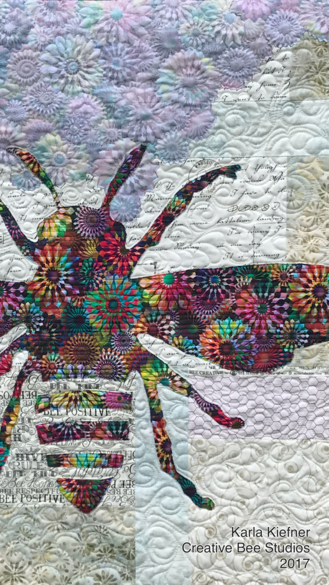
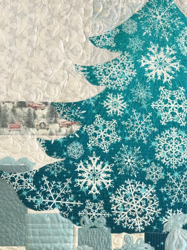
- As you can see above, Phoebee’s focus fabric is strong enough to accommodate even medium background fabrics.
- Have fun playing with value and enjoy your quilting journey!
- So how do you remove color from fabrics you are auditioning?
Learn how to overcome the mysteries of value. It’s easy!
Value can be a head-scratcher. Learn the simple tip for how to conquer fabric value!
To begin, you need to come to terms with the fact that fabric values change, depending on what is next to them. Initially, I was resistant to this!
When separating your fabrics for a new quilt project, you might wonder how to know which fabrics go where!
Undoubtedly, it’s about more than piles of darks, mediums, and lights. The key is to learn how to measure their value.
I learned a valuable (wink) lesson when I stumbled upon the nuances of value when using both sides of fabric. See my design story HERE.
Up to this point, my method for separating values didn’t account for what those fabrics were next to. Consequently, two very cool Bonnie Hunter quilts I made (and still love) never displayed the secondary pattern her designs are known for. What did I do wrong?
Test your values.
How can a fabric value change, you ask? While the value of the fabric itself doesn’t physically change, how you see that value is affected by what is near it. Let me explain and then give you a simple way to test your values…
My Light looks too dark when I use that light of a Medium!
confused quilter
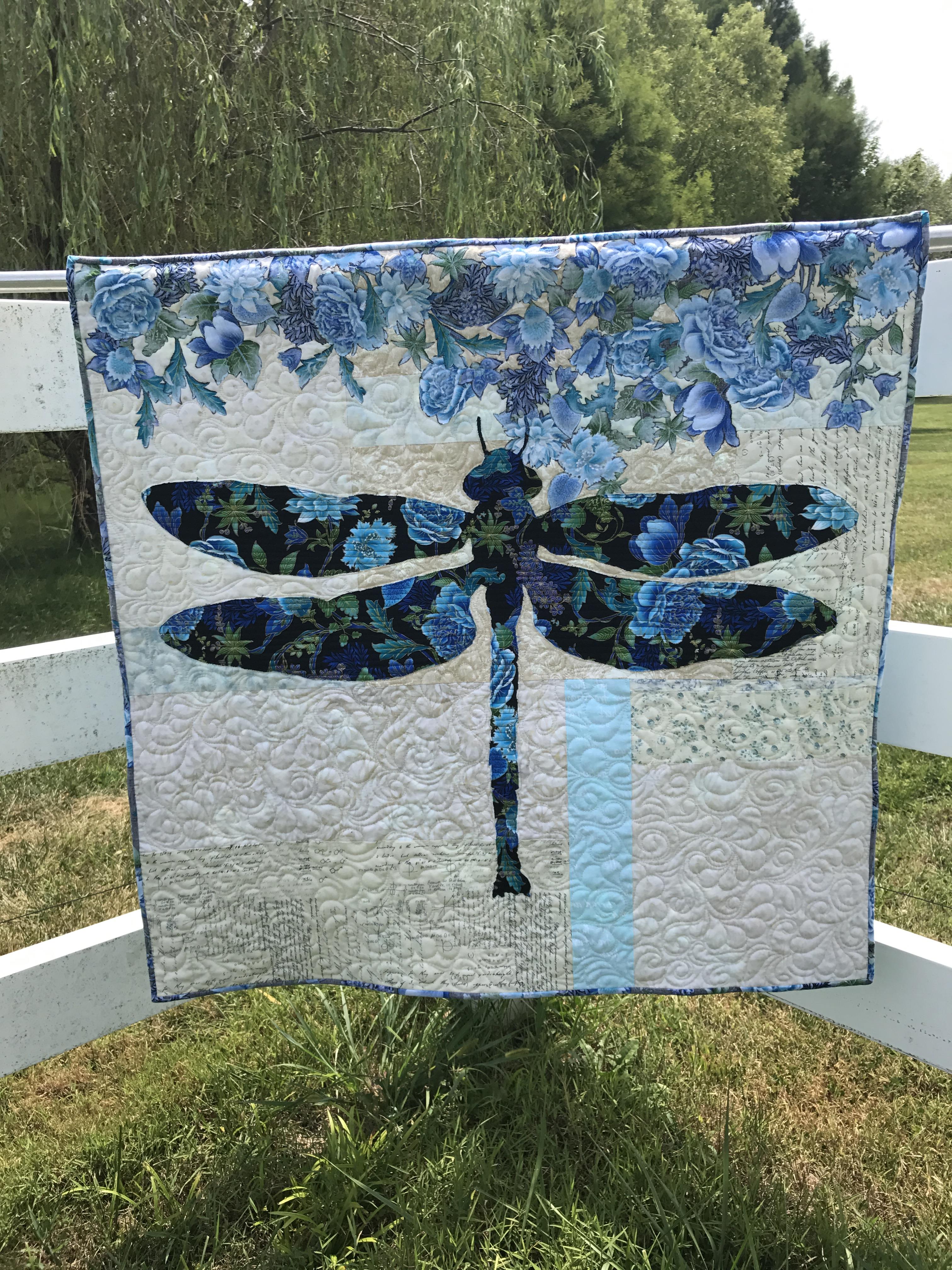
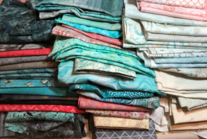
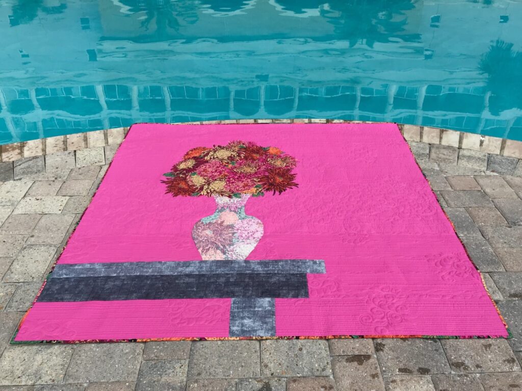
The three piles of fabrics shown above are my selection for the free River Heritage Mystery Quilt Pattern I am designing for my quilt guild. Darks, Mediums, Lights. This should be straight forward.
However, when you place, for example, a darker Light and a lighter Medium next to each other, they suddenly look similar in value. Color can make it difficult to determine value.
So how do you remove color from fabrics you are auditioning?
Take black and white photos. I learned this by testing values of both sides of fabric. Each pattern I design that uses both beautiful sides of fabric comes with a detailed guide for auditioning fabrics for that quilt project.
Also, read more here about The Tricky Traits of Value!
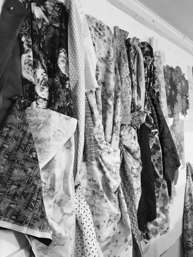
The best way I have found to truly see the value of a fabric is to take a black and white picture.
If you are in one of my classes, you see that I don’t give any opinions about fabric options without seeing a black and white photo first. Even with years of experience looking at both sides of fabric, I can still be tricked by color! Quilters seem to have lots of fun with the process of auditioning and choosing fabrics. Oftentimes, they help each other and end up trading fabrics to get just the right mix for their project.
So grab your stash and your camera !
Now you know the how-to tip for determining value. Why not have fun practicing on a quilt made with BOTH beautiful sides of fabric!
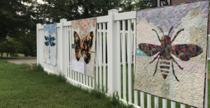

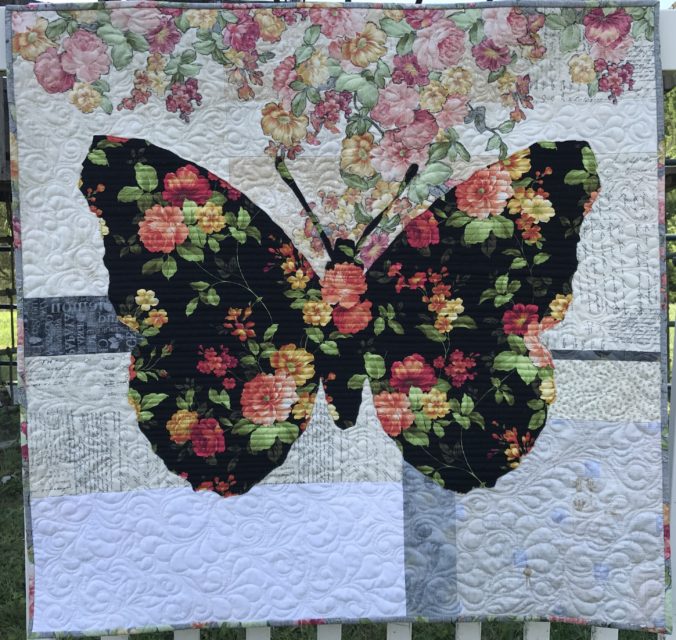
 Next came Belle. She’s a French butterfly. Belle means “beautiful” (I NEVER got that about Beauty and the Beast – blush).